
library(lubridate)
library(dotwhisker)
library(broom)
library(dplyr)
library(ggplot2)
library(cem)
library(dplyr)
library(car)
Introduction
I’ve been thinking a lot about handedness recently. I have two boys that I hope play a little baseball. Both are tracking to be tall-ish and may be athletic. I really want them to pitch. It’s become a pretty accepted point of view that left handed pitchers are at a premium in MLB. The one case the really make that clear was a pitcher named JA Happ. Happ, by all accounts, is a slightly below average left handed starting pitcher. This offseason, Happ signed a 3 year deal with the Blue Jays for 36 milliion dollars. When the news broke someone on twitter wrote, “My God. Parents, put a baseball in your child’s left hand and hope for the best.”
So, I want to test that assumption. The Lehmann database is great, but the information I need is in several different data files. I need the master file for the pitching hand, I need salaries (obviously), and pitching stats to compare apples to apples.
master <- read.csv("D:/Baseball/Master.csv", stringsAsFactors = FALSE)
salary <- read.csv("D:/Baseball/salaries.csv", stringsAsFactors = FALSE)
pitching <- read.csv("D:/Baseball/pitching.csv", stringsAsFactors = FALSE)
Data Cleaning
I don’t really need to look back at pitching salaries from 1910. I am going to pick an arbitrary cut point (2005). Salaries really started to explode after that.
master$finalGame <- as.Date(master$finalGame, "%m/%d/%Y")
master$year <- year(master$finalGame)
master <- subset(master, master$year >=2005)
pitching <- subset(pitching, pitching$year >=2005)
salary <- subset(salary, yearID >=2005)
salary$year <- salary$yearID
salary$player_id <- salary$playerID
salary$yearID <- NULL
salary$playerID <- NULL
df <- merge(salary, pitching, by=c("year", "player_id"))
master$player_id <- master$playerID
df <- merge(df, master, by=c("year", "player_id"))
df$throw <- df$throws.y
head(df)
## year player_id teamID lgID salary stint team_id league_id w l g gs cg
## 1 2005 adamste01 PHI NL 500000 1 PHI NL 0 2 16 0 0
## 2 2005 almanca01 TEX AL 1100000 1 TEX AL 0 0 6 0 0
## 3 2005 alvarwi01 LAN NL 2000000 1 LAN NL 1 4 21 2 0
## 4 2005 anderbr02 KCA AL 3250000 1 KCA AL 1 2 6 6 0
## 5 2005 aybarma01 NYN NL 425000 1 NYN NL 0 0 22 0 0
## 6 2005 bartocl01 CHN NL 318600 1 CHN NL 0 2 19 0 0
## sho sv ipouts h er hr bb so baopp era ibb wp hbp bk bfp gf r sh sf
## 1 0 0 40 25 19 3 10 4 0.403 12.83 2 0 4 0 77 5 19 1 0
## 2 0 0 15 10 8 2 7 3 0.435 14.40 0 4 1 0 33 2 8 0 2
## 3 0 0 72 31 15 7 7 16 0.316 5.63 0 0 0 0 109 3 15 2 2
## 4 0 0 92 39 23 7 4 17 0.305 6.75 1 0 0 1 133 0 24 0 1
## 5 0 0 76 31 17 4 7 27 0.301 6.04 1 0 1 0 114 4 17 1 2
## 6 0 0 59 23 12 7 11 15 0.307 5.49 0 0 2 0 91 7 13 2 1
## g_idp playerID birthYear birthMonth birthDay birthCountry birthState
## 1 NA adamste01 1973 3 6 USA AL
## 2 NA almanca01 1973 11 6 D.R. Santiago
## 3 NA alvarwi01 1970 3 24 Venezuela Zulia
## 4 NA anderbr02 1972 4 26 USA VA
## 5 NA aybarma01 1972 5 4 D.R. Peravia
## 6 NA bartocl01 1979 9 5 USA TX
## birthCity deathYear deathMonth deathDay deathCountry deathState
## 1 Mobile NA NA NA
## 2 Santiago NA NA NA
## 3 Maracaibo NA NA NA
## 4 Portsmouth NA NA NA
## 5 Bani NA NA NA
## 6 West NA NA NA
## deathCity nameFirst nameLast nameGiven weight height bats throws
## 1 Terry Adams Terry Wayne 180 75 R R
## 2 Carlos Almanzar Carlos Manuel 166 74 R R
## 3 Wilson Alvarez Wilson Eduardo 175 73 L L
## 4 Brian Anderson Brian James 190 73 L L
## 5 Manny Aybar Manuel Antonio 165 73 R R
## 6 Cliff Bartosh Clifford Paul 175 74 L L
## debut finalGame retroID bbrefID
## 1 8/10/1995 2005-05-23 adamt001 adamste01
## 2 9/4/1997 2005-04-30 almac001 almanca01
## 3 7/24/1989 2005-09-28 alvaw001 alvarwi01
## 4 9/10/1993 2005-05-08 andeb002 anderbr02
## 5 8/4/1997 2005-06-10 aybam001 aybarma01
## 6 5/15/2004 2005-06-18 bartc001 bartocl01Visualization
Okay, I’ve got the data in a format that I can use. Let’s visualize. Let’s create a dataframe of just lefties and just righties.
righties <- subset(df, df$throws =="R")
lefties <- subset(df, df$throws =="L")
mean(lefties$salary)
## [1] 2674764mean(righties$salary)## [1] 2680025So, there’s nothing there. Less than $10,000 difference in the two samples. Let’s press onward.
I’m not going to display a lot of what I did behind the scenes but it’s a lot of subsetting and creating color palettes. Let’s go right to visuals.
ggplot(histogram, aes(x=Group.1, y = x/1000)) + geom_bar(aes(fill=throw),stat="identity", position= "dodge") + xlab("Season") + ylab("Salary (in thousands)") + scale_fill_manual(values=handPalette)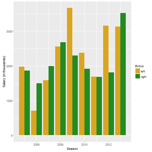
This is also inconclusive. Just take 2011-2013. In 2011, lefties and righties made basically the same. In 2012 lefties made (on average) more a million dollars more than righties. However in 2013, righties made a couple hundred grand more than lefties.
ggplot(leftleague, aes(x=Group.1, y = x/1000)) + geom_bar(aes(fill=league),stat="identity", position= "dodge") + xlab("Season") + ylab("Salary (in thousands)") + ggtitle("Lefties Salaries") + scale_fill_manual(values=leaguePalette)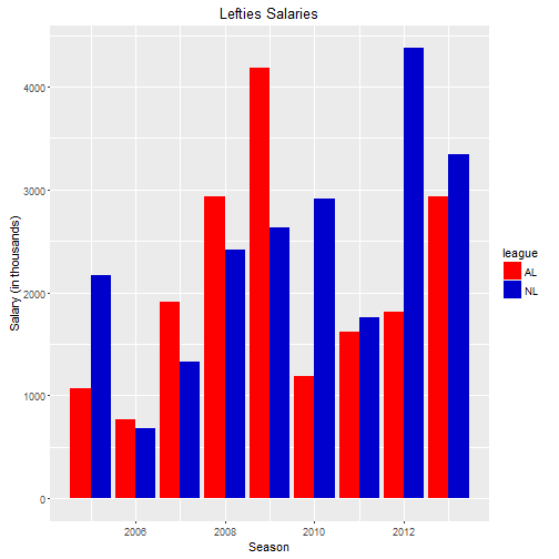
ggplot(rightleague, aes(x=Group.1, y = x/1000)) + geom_bar(aes(fill=league),stat="identity", position= "dodge") + xlab("Season") + ylab("Salary (in thousands)") + ggtitle("Righties Salaries") + scale_fill_manual(values=leaguePalette)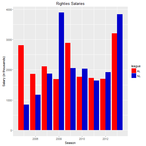
Looking at salaries in the AL vs the NL is interesting. Lefties in the National League made more money than righties for 2010-2013. The story is a little more mixed for righties.
Let’s take a look at a scatterplot for ERA and salary.
p <- ggplot(df, aes(salary/1000, era))
p + geom_point(aes(colour = df$throw)) + xlim(5000, 25000) + ylim(0, 10) + scale_color_manual(values = c("#daa520", "#228b22")) + xlab("Salary (in thousands)") + ylab("ERA") +  theme(legend.title=element_blank())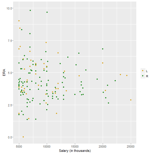
I truncated this data on both the x and the y axes. Any ERA over 10 is not going to keep you in the league for a long time so those were dropped. And any salary below 500k is going to be a player that has not reached arbitration and therefore is not really getting paid what the market will bear. So the picture is mixed so far. The next step would be a regression.
Regression and Matching
reg1 <- lm(salary ~ era + w + l + g + ipouts + throws + baopp + so + bb , data=df)
summary(reg1)
##
## Call:
## lm(formula = salary ~ era + w + l + g + ipouts + throws + baopp +
## so + bb, data = df)
##
## Residuals:
## Min 1Q Median 3Q Max
## -10381417 -1518634 -786951 793625 16901303
##
## Coefficients:
## Estimate Std. Error t value Pr(>|t|)
## (Intercept) 2801563.4 583014.3 4.805 1.80e-06 ***
## era 1875.1 22269.7 0.084 0.932915
## w 139291.6 74154.5 1.878 0.060641 .
## l 371822.9 67913.1 5.475 5.64e-08 ***
## g -32995.3 6125.3 -5.387 9.11e-08 ***
## ipouts 339.9 3342.7 0.102 0.919032
## throwsR -176206.0 237314.7 -0.742 0.457974
## baopp -2486503.4 1927267.8 -1.290 0.197314
## so 26083.3 7856.4 3.320 0.000935 ***
## bb -62288.0 13925.8 -4.473 8.68e-06 ***
## ---
## Signif. codes: 0 '***' 0.001 '**' 0.01 '*' 0.05 '.' 0.1 ' ' 1
##
## Residual standard error: 3310000 on 924 degrees of freedom
## (2 observations deleted due to missingness)
## Multiple R-squared: 0.256, Adjusted R-squared: 0.2488
## F-statistic: 35.33 on 9 and 924 DF, p-value: < 2.2e-16dwplot(reg1) + geom_vline(xintercept = 0, colour = "grey60", linetype = 2)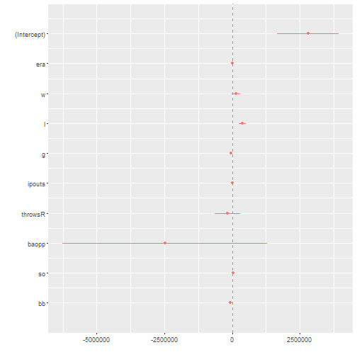
I’ve also included a dotwhisker plot that helps to visualize a regression. If the vertical dashed line is not intersected by the dots or the horizontal line (the confidence intervals) then it’s statistically significant. Or you could read the regression table.
So salary is our dependent variable and I’m going to use a lot of the stats that should predict a better pitcher. ERA, wins, losses, etc. Unfortunately this data has a lot of noise in it. A good example? Losses actually predict a higher salary. That may be because losses denote starting pitchers and starting pitchers are much more likely to take a loss than a reliever. Games pitched predicts lower salary but that’s probably because relievers can show up in 80 games a year while starters average around 35 or so. Strike outs drive up salary and walks drive it down. Interestingly enough. Throwing right handed is not statistically significant.
The next thing I want to do is coarsened exact matching. Gary King and some others wrote the package. What it does is essentially this: it fights someone in the treatment case (in our example that’s left handed pitchers) and finds someone in the control case (righties) who is very close in terms of performance metrics. So this will compare apples to apples. It will help to correct the problems of pitchers have more games or less games. It will compare pitchers with lower ERAs to those with lower ERAs and so on. The one thing that needs to be done is variables need to be binned together. In order for the package to actually find a match it needs era to be broken up into several ranges (3.00-3.50, 3.51-4.00). I will do that below.
cem <- select(df, salary, w, l, g, gs, sv, ipouts, h, er, bb, so, baopp, era, throws, lgID)
cem <- data.frame(na.omit(cem))

cem$treated = recode(cem$throws, "'L'=1; 'R'=0;", as.factor.result=FALSE)

tr <- which(cem$treated==1)
ct <- which(cem$treated==0)

mean(cem$salary[tr]) - mean(cem$salary[ct])
## [1] -700.6434cem$league = recode(cem$lgID, "'NL'=1; 'AL'=2;", as.factor.result=FALSE)
cem$lgID <- NULL
cem$ba <- recode(cem$baopp, ".000:.100= 1; .151:.200 =3; .201:.250=4; .251:.300 =5; .301:.350 =6; .351:.400 =6; .401:.500 =7; .501:.700 =8")
cem$baopp <- NULL
cem$ERA <- recode(cem$era, ".000:.1= 1; 1.01:2.00 =2; 2.01:3=3; 3.01:4 =4; 4.01:5 =5; 5.01:10 =6")
cem$era <- NULL
cem$games <- recode(cem$g, "1:10= 1; 11:20 =2; 21:30=3; 31:40 =4; 41:50 =6; 51:80 =6")
cem$g <- NULL
cem$loss <- recode(cem$l, "0:2= 1; 2:5 =2; 6:10=3; 10:18 =4")
cem$l <- NULL
cem$walks <- recode(cem$bb, "0:5= 1; 6:10 =2; 11:15=3; 16:20 =4; 25:30 =5; 31:88=6")
cem$bb <- NULL
mat <- cem(treatment = "treated", data = cem, drop = "salary", keep.all=TRUE)
est <- att(mat, salary ~ treated, data = cem)
summary(est)##
## Treatment effect estimation for data:
##
## G0 G1
## All 655 279
## Matched 171 96
## Unmatched 484 183
##
## Linear regression model estimated on matched data only
##
## Coefficients:
## Estimate Std. Error t value p-value
## (Intercept) 1383222 130156 10.627 <2e-16 ***
## treated -39502 217062 -0.182 0.8557
## ---
## Signif. codes: 0 '***' 0.001 '**' 0.01 '*' 0.05 '.' 0.1 ' ' 1After all that, the answer is really not exciting at all. There is no statistical relationship between throwing hand and pitcher’s salary. Being left handed could mean anything from making 600k more or 300k less than a right hander. In other words? It means nothing.
Concluding Thoughts
So, if the perception is that left handers make more than right handers why doesn’t the data bear this out? I have a theory, at least. Maybe two.
-
Baseball has a really weird salary structure. Not to go too far into it but for the first three years that a player is in the majors, he basically makes the league minimum (around 500k). After that he goes through three years of arbitration where his salary rises each of those three years. He is still not receiving his market value. Really, that doesn’t happen until free agency which doesn’t happen for most players until they are 28-30 years old. Many elite pitchers will then sign a huge deal for six or seven years. They really only get one bite at the apple.
-
Relievers screw everything up. As another Kaggle user found, teams overpay closers. That also means that they underpay middle relievers. If I could break this down to just starting pitchers I might see something different but I didn’t do that is because lefties seem to be more important in the bullpen. Guys like Randy Choate was a LOOGY. He couldn’t really do much well except get out other left handers. And he pitched for a long time doing just that. A left handed starter cannot be a LOOGY.
-
This data is just noisy. Inflated salaries have not existed long enough to really have a large enough dataset.