
library(ggplot2)
library(readr)
library(dplyr)
library(extrafontdb)
library(extrafont)
library(jsonlite)
library(purrr)
library(choroplethr)
library(RColorBrewer)
library(gridExtra)
library(coefplot)
library(DT)
Which schools in Illinois are in the most trouble?
Illinois has a budget crisis. There are currently about 60 hours left in the fiscal year and the state still hasn’t passed a budget. One of the biggest pressure points is K-12 funding. If the general assembly doesn’t pass K-12 funding soon then many schools across the state will be unable to open. As a way to show constituents that members of the General Assembly posted a spreadsheet that indicated how many days every school district in the state could operate if they didn’t receive funding in the upcoming fiscal year. I wanted to analyze that.
schools <- read.csv("D:/IL_schools/schools.csv", stringsAsFactors = FALSE)
schools$days <- as.numeric(schools$days)
schools$name <- sub(".*? (.+)", "\\1", schools$name)
Some initial analysis
Let’s take a broad look at the data.
dim(schools)## [1] 853 6There are 852 districts in the state.
summary(schools$days)## Min. 1st Qu. Median Mean 3rd Qu. Max. NA's
## 6.0 158.5 209.0 196.6 246.0 279.0 542Here’s some simple frequencies. There is one big thing to note here: there are 541 NA’s. Those NA’s are actually districts that can remain open for the entire year. That means about 63% of districts can survive the entire year without state funding.
ggplot(schools, aes(days)) +
    geom_histogram() + xlab("Number of Days into the School year") + ylab("# of Schools that Would Run out of Money") + theme(text=element_text(size=16, family="Roboto Condensed"))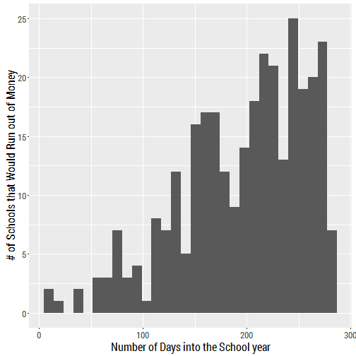
We have to remember that this histogram does not include those 541 who can make it the entire year. Most would survive over 200 days, as well.
Let’s run the same histogram and include the schools who have an entire year of funding in their reserves.
schools$days[is.na(schools$days)] <- 365
ggplot(schools, aes(days)) +
    geom_histogram() + xlab("Number of Days into the School year") + ylab("# of Schools that Would Run out of Money") + theme(text=element_text(size=16, family="Roboto Condensed"))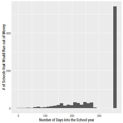
A lot of schools in Illinois are in very good shape. About 2/3 of them have a year of reserves on hand. That’s a pretty surprising statistic.
Mapping
I need to do a lot of things with this data to generate a map of the counties that are most in danger. The first thing I’m going to do is eliminate all those districts that could survive the entire year and just deal with 311 that remain.
sub <- subset(schools, days < 365)In order for a map to make any sense it can’t just be a raw count of number of schools in trouble by county, but it needs to expressed as a percentage of schools that have a limited amount of funds. Here’s how I got there.
df1 <- as.data.frame(table(sub$county))
df2 <- as.data.frame(table(schools$county))
merge <- merge(df1,df2,by=c("Var1"))
merge$percent <- merge$Freq.x/merge$Freq.y
merge = merge[-1,]
fips <- read.csv("D:/primary_results.csv", stringsAsFactors = FALSE)
fips <- subset(fips, candidate == "Donald Trump")
merge$county <- merge$Var1
ferge <- merge(merge,fips,by=c("county"))
map <- select(ferge, county, Freq.x, Freq.y, percent, fips)
There’s a bunch of syntax there. Basically I created a smaller dataframe that has a column with just those percentages and then I had to add the FIPS code for each county in order to actually map the counties. That’s below.
map$region <- map$fips
map$value <- map$percent
choro = CountyChoropleth$new(map)
choro$title = "Schools in Trouble by County"
choro$set_num_colors(1)
choro$set_zoom("illinois")
choro$ggplot_polygon = geom_polygon(aes(fill = value), color = NA)
choro$ggplot_scale = scale_fill_gradientn(name = "Percent", colours = brewer.pal(8, "Reds"))
choro$render()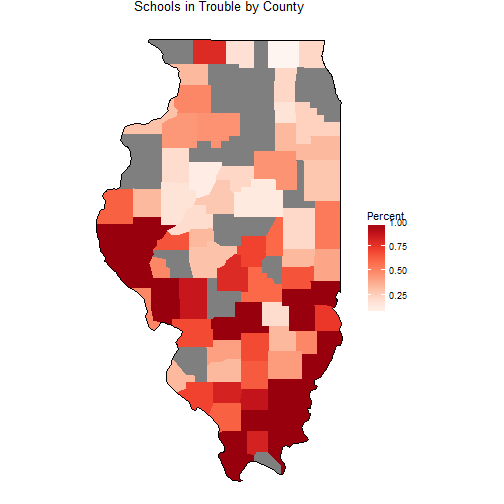
First thing. Counties in gray indicated counties that don’t have a school district that will run out of money this fiscal year. The other big takeaway is that there are a lot of counties in southern Illinois that are really struggling. In fact, southeastern Illinois is ground zero for potential problems.
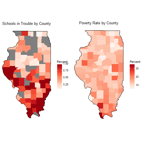
I wanted to compare the number of schools in trouble with the poverty rate by county. It’s somewhat interesting to note that a lot of counties in Illinois have about the same level of poverty. Many are in the 10-15% range. There is some more poverty in southern Illinois but the difference isn’t really that stark.
Breakdown by Members of the General Assembly
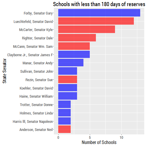
It might be helpful for our state representatives to know which of them represent the highest number of schools that are in danger of closing down. Let’s do a count and display that in a histogram.
count_rep <- read.csv("D:/IL_schools/count_rep.csv", stringsAsFactors = FALSE)

ggplot(count_rep, aes(x=reorder(rep, n), y = n, fill = party)) + geom_bar(stat="identity") + coord_flip() + ylab("Number of Schools") + xlab("State Representative") + scale_fill_manual(values = alpha(c("blue", "red"), .65)) + theme(legend.position="none") + theme(text=element_text(size=16, family="Roboto Condensed")) + labs(title = "Schools with less than 180 days of reserves")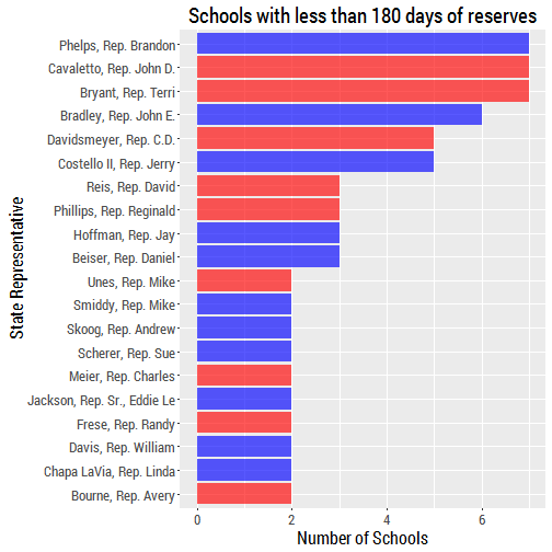
DataTable
Below is datatable that is interactive and will allow you to search for any school district and look at the amount of time they have before the money runs out.
schools$Days <- NULL
datatable(schools, colnames = c('School', 'County', 'State Rep.', 'State Senator', 'Date the Money is Gone', 'Number of Days'))
## Error in file(con, "rb"): cannot open the connection