
#install.packages("ggplot2")
#install.packages("car")
#install.pacakges("dplyr")
library(ggplot2)
library(car)
library(dplyr)
Just going to load the data
simon <- read.csv(url("http://goo.gl/exQA14"))Introduction to Filter
I wanted to show all of you the filter command. It’s part of the dplyr package. It allows you to filter on a certain condition. Let’s say that I only wanted to look at the part of the sample that is downstate. The variable is called “area” and downstate is value label 3. You can find that in the codebook. Here’s the syntax.
downstate <- filter(simon, area == 3)
dim(simon)
## [1] 1000 97dim(downstate)## [1] 300 97Using the “dim” command gives you the dimensions of the data (rows and columns). You can see here that our downstate dataset has 300 rows, while our entire dataset (simon) has 1000 rows.
Filter on Two Conditions
Let’s say that you wanted to filter on TWO conditions at one time. Let’s say downstate union folks. Here’s how we do that.
downstate_union <- filter(simon, area == 3 & union == 1)
dim(simon)
## [1] 1000 97dim(downstate)## [1] 300 97dim(downstate_union)## [1] 75 97If you look in the top right you will see three datasets in your environment: simon, downstate, and downstate_union. As you can see from our “dim” command that there are only 75 people who meet the two conditions that we set.
Let’s say you wanted to do a barchart to illustrate the political ideology of the entire sample and then the political ideology of just people who live downstate. How would you do that?
ggplot(simon, aes(party_aff)) +geom_bar()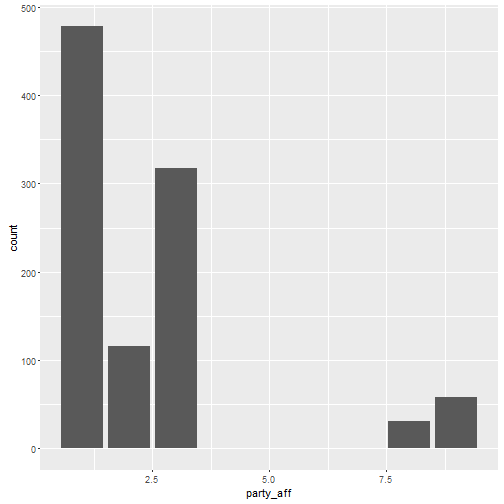
ggplot(downstate, aes(party_aff)) +geom_bar()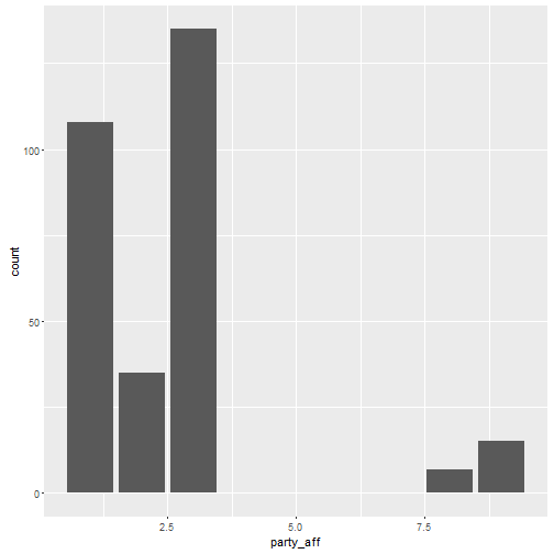
The only thing we changed here is simple: the first part of the ggplot command. I plotted the same variable in both party_aff. However, the first plot is using the entire dataset (simon) and the second plot is using the subset that we created earlier (downstate)
Note here that the graphs have a different scale on the y-value because there are 1000 people in the entire sample and just 300 in the downstate one.
Filtering and Plotting on the Same Line
Here’s some advanced stuff. Let’s filter AND plot all in one line of code. Let’s look at party affiliation in each of the three areas that the Simon poll assessed.
ggplot(simon %>% filter(area ==1), aes(party_aff)) + geom_bar() + ggtitle("City of Chicago")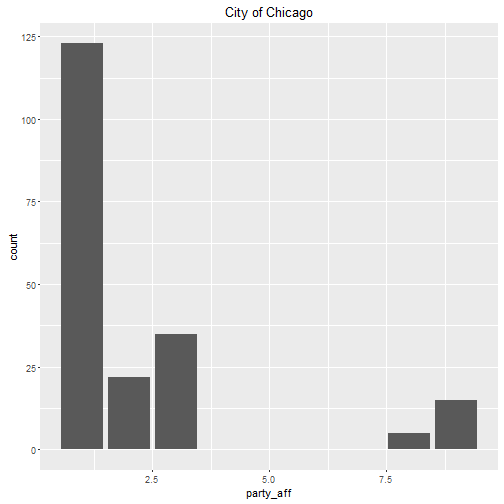
ggplot(simon %>% filter(area ==2), aes(party_aff)) + geom_bar() + ggtitle("Suburbs")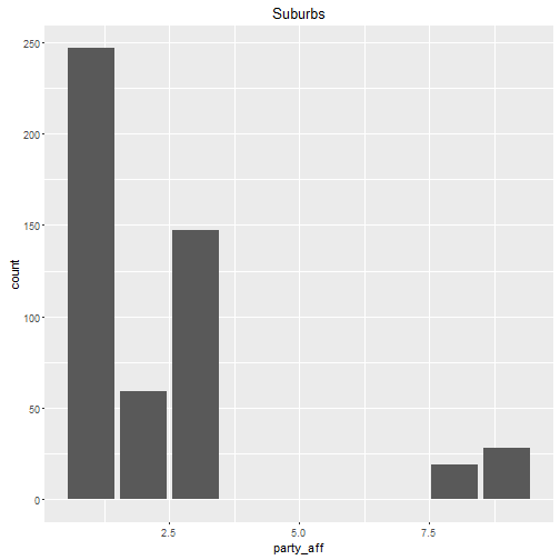
ggplot(simon %>% filter(area ==3), aes(party_aff)) + geom_bar() + ggtitle("Downstate")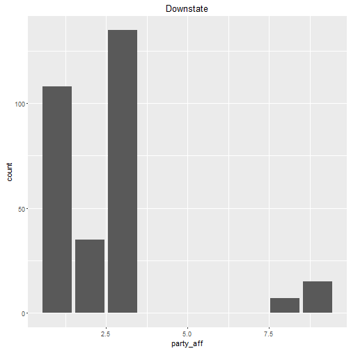
Here’s what I did: I plotted party affiliation for each of the three regions. This symbol I used “%>%” is called a pipe. It’s party of the dplyr package and allows you to put several commands together in a single line of code. If you want to use it quickly in R Studio there’s a keyboard shortcut. It’s Control+Shift+M.
What do the bar charts tell you? Lots of Democrats in Chicago and the suburbs. More Republicans downstate.