
library(ggplot2)
library(foreign)
library(gridExtra)
library(RColorBrewer)
library(choroplethr)
library(choroplethrMaps)
library(viridis)
library(dplyr)
Introduction
Donald Trump won the Presidency. How? It’s still very early to do a lot of analysis as the turnout data isn’t actually settled yet. However there is some data available. Thankfully Michael Kearney posted an awesome data file with the county level vote shares for each candidate. I am going to use that along with some other data that I have collected over time see how Trump won.
Let’s Just Map
vote <- read.csv("D:/2016_election/pres16results.csv", stringsAsFactors = FALSE)
vote$fips <- gsub("(?<![0-9])0+", "", vote$fips, perl = TRUE)
census <- read.dta("D:/2016_election/relcensus.dta", convert.factors = FALSE)
merge <- merge(census, vote, by=c("fips"))
pres <- filter(merge, cand_name == "Donald Trump" | cand_name == "Hillary Clinton")
trump <- filter(merge, cand_name == "Donald Trump")
clinton <- filter(merge, cand_name == "Hillary Clinton")
trump$diff <- trump$pct - clinton$pct
So, I read in the dataset, then I created a couple subsets. Finally I added a variable which is the Trump vote share minus the Clinton vote share to generate the actual margin of victory by county.
Now, let’s map.
trump$region <- trump$fips
trump$value <- trump$diff
palette_rev <- rev(brewer.pal(8, "RdBu"))
choro = CountyChoropleth$new(trump)
choro$title = "Trump Vote Share"
choro$set_num_colors(1)
choro$ggplot_polygon = geom_polygon(aes(fill = value), color = NA)
choro$ggplot_scale = scale_fill_gradientn(name = "Percent", colours = palette_rev)
choro$render()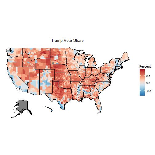
Obviously, these maps don’t tell the whole story. Our eye equates size with importance. Unfortunately, urban counties are small on the map but have huge populations. It is evident that Trump won lots and lots of counties. Clinton did well in New England, the west coast and along the southern border. Trump did well everywhere else.
Demographic Explanations
vote <- read.csv("D:/2016_election/pres16results.csv", stringsAsFactors = FALSE)
poverty <- read.csv("D:/2016_election/povertyus.csv", stringsAsFactors = FALSE)
poverty <- select(poverty, fips, poverty)
merge <- merge(merge, poverty, by=c("fips"))
educ <- read.csv("D:/2016_election/educ.csv", stringsAsFactors = FALSE)
merge <-merge(merge, educ, by=c("fips"))
pres <- filter(merge, cand_name == "Donald Trump" | cand_name == "Hillary Clinton")
trump <- filter(merge, cand_name == "Donald Trump")
clinton <- filter(merge, cand_name == "Hillary Clinton")
So, I loaded in some basic county level data on poverty rates and education rates. I am going to scatterplot each of these.
trump$diff <- trump$pct - clinton$pct
ggplot(trump, aes(x=poverty, y=pct))+
  my_theme()+
  geom_point(shape=1) +
  geom_smooth()+
  labs(title= "", y="Trump Vote Share", x="Poverty Rate")+
  ggtitle(expression(atop(bold("Trump and Poverty"), atop(italic("Association between Trump Vote Share and Poverty Rate"),""))))+
  theme(plot.title = element_text(size = 16, face = "bold", colour = "black", vjust = 0.5, hjust=0.5))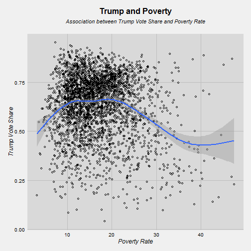
So, here’s a relationship worth thinking about. Trump got around 50% of the vote in very rich counties. However, his vote share increases as the poverty rate moves from 3% to 10%. Then when it hits 10% it stays at around 65% support until the poverty rate gets around 25% and Trump’s support then drops again. One explanation is that urban counties have a lot of poverty but also have a lot of Democratic strongholds, that could be an explanation for why we see the vote share go down. Let’s look at education.
trump$diff <- trump$pct - clinton$pct
ggplot(trump, aes(x=ba.above, y=pct))+
  my_theme()+
  geom_point(shape=1) +
  geom_smooth()+
  labs(title= "", y="Trump Vote Share", x="% with a Bachelor's Degree or Above")+
  ggtitle(expression(atop(bold("Trump and Education"), atop(italic("Association between Trump Vote Share and % of People with a Bachelor's Degree"),""))))+
  theme(plot.title = element_text(size = 16, face = "bold", colour = "black", vjust = 0.5, hjust=0.5))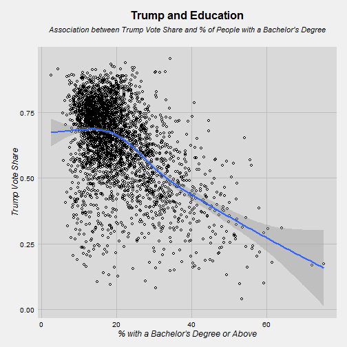
The relationship here is much more linear. Trump did very well in counties with low levels of education. There are a lot of those counties. You can see how many points there are to the left of the 20% line. Those are counties where less than 1 in 5 people have a 4 year college degree. The relationship is strongly negative. The more educated the county, the worst Trump did.
Religious Variables
The U.S. Religious Census provides religious demography data at the county level for each county in the United States. I am going to merge that data with the voting data used prior.
ggplot(trump, aes(x=evanrate, y=pct))+
  my_theme()+
  geom_point(shape=1) +
  geom_smooth()+
  labs(title= "", y="Trump Vote Share", x="Evangelical Adherence (per 1000)")+
  ggtitle(expression(atop(bold("Trump and Evangelicals"), atop(italic("Association between Trump Vote Share and Evangelical Concentration"),""))))+
  theme(plot.title = element_text(size = 16, face = "bold", colour = "black", vjust = 0.5, hjust=0.5))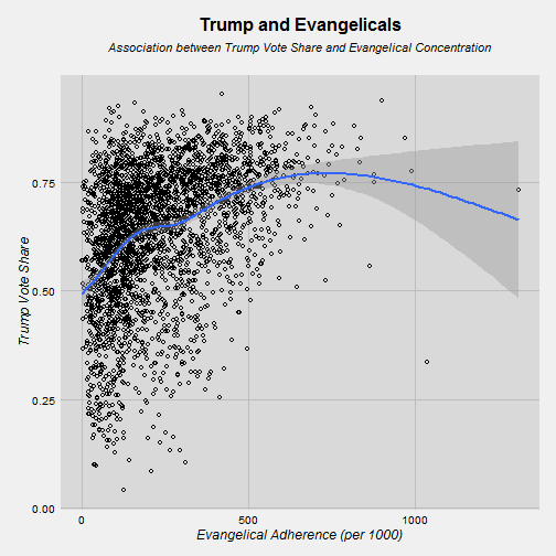
Here there is a clearly positive relationship. More evangelicals = more Trump votes. This is very strong from 0 to 500 evangelicals. After 500 evangelicals the CIs get much larger as the number of cases drops.
ggplot(trump, aes(x=cathrate, y=pct))+
  my_theme()+
  geom_point(shape=1) +
  geom_smooth()+
  labs(title= "", y="Trump Vote Share", x="Catholic Adherence (per 1000)")+
  ggtitle(expression(atop(bold("Trump and Catholics"), atop(italic("Association between Trump Vote Share and Catholic Concentration"),""))))+
  theme(plot.title = element_text(size = 16, face = "bold", colour = "black", vjust = 0.5, hjust=0.5))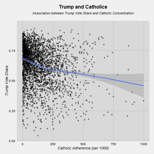
Here the relationship is the opposite. More Catholics = less Trump votes. This is especially strong going from 0 Catholics to 250 Catholics per 1000. AFter that there is a level off. Notice how the trend line doesn’t move close to 50% until you get past 500 Catholics per 1000.
Religious Diversity Index
I wanted to see how religious diversity impacted Trump’s support. It took me a while to arrive at an acceptable measure. So, here’s what I did:
census <- read.dta("D:/2016_election/relcensus.dta", convert.factors = FALSE)
s.census <- select(census, evanrate, bprtrate, cathrate, ldsrate, orthrate, mprtrate)
s.census$jewrate <- census$cjudrate + census$ojudrate + census$rjudrate + census$rfrmrate
s.census[is.na(s.census)]<- 0
s.census$max <- apply(s.census, 1, max)
I created a small dataset containing a selection of religious traditions that are available in the census data. I used evangelical Protestants, mainline Protestants, black Protestants, Catholics, Latter-Day Saints, Orthodox Church, Mainline Protestants, and Jewish traditions. Then I used the “apply” function in R to find the largest tradition for each individual county. My logic is this: if a county has a low level of adherents to all those traditions, it is going to be religiously diverse. My data does not contain a variable for no affiliation or atheism. One could argue that if there aren’t many adherents to those five traditions then they are probably nonaffiliated. I would argue that nonaffiliated is really not a tradition and a county that was full of lots of those people were be pretty diverse religiously because nonaffiliated people are not homogeneous.
I’m now going to scale this measure from 0 (low diversity) to 1 (high diversity) and map.
s.census$fips <- census$fips
s.census$test <- 1308.69 - s.census$max
s.census$test <- s.census$test/1308.69

div_filter <- filter(s.census, test >= .35)

div_filter$region <- div_filter$fips
div_filter$value <- div_filter$test
palette_rev <- rev(brewer.pal(8, "RdBu"))
choro = CountyChoropleth$new(div_filter)
choro$title = "Religious Diversity"
choro$set_num_colors(1)
choro$ggplot_polygon = geom_polygon(aes(fill = value), color = NA)
choro$ggplot_scale = scale_fill_gradientn(name = "Diversity Scale", colours = viridis(32))
choro$render()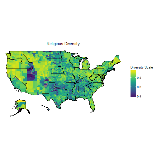
This map looks sort of like you would expect it to. Utah has a huge swatch of purple, meaning it has low levels of religious diversity. That makes sense knowing how large the Mormon population is in Utah. Other areas that look homogeneous are significant parts of the south as well as north Texas and the Great Plains. There is a lot of diversity to be found in the west, specifically Washington and Oregon. There is also some diversity through New England even into Ohio and Michigan.
vote <- read.csv("D:/2016_election/pres16results.csv", stringsAsFactors = FALSE)
vote$fips <- gsub("(?<![0-9])0+", "", vote$fips, perl = TRUE)
cmerge <- merge(s.census, vote, by=c("fips"))
trump <- filter(cmerge, cand_name == "Donald Trump")

div_filter <- filter(trump, test >= .35)

ggplot(div_filter, aes(x=test, y=pct))+
  my_theme()+
  geom_point(shape=1) +
  geom_smooth()+
  labs(title= "", y="Trump Vote Share", x="Religious Diversity")+
  ggtitle(expression(atop(bold("Trump and Religious Diversity"), atop(italic("Higher Values = More Diversity"),""))))+
  theme(plot.title = element_text(size = 16, face = "bold", colour = "black", vjust = 0.5, hjust=0.5))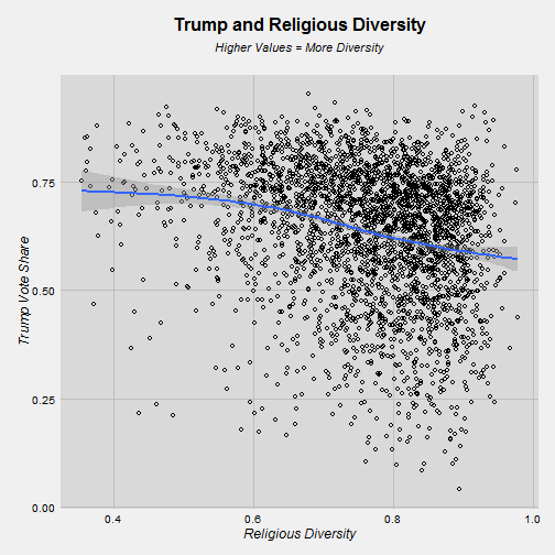
There is a story to be told here, as well. Trump did better in places that had low levels of religious diversity and did worse when diversity rose. To put this in other terms, for every 10% increase in religious diversity, Trump’s vote share dropped by 3.4%.
Concluding Thoughts
Trump’s win was a long shot. Every serious modeler put his changes at least than a third, but he won. How did he do it? That’s a complicated answer. However it seems like Trump ran up in the score in places that were religious homogeneous and had lower levels of education. There are many rural areas where that is the case.
Obviously there are many more angles to analysis here. Age, changes in employment, racial diversity, etc. But this is a start toward understanding how Trump pulled this election off.
For the full syntax and data to do this analysis, check out my github repository