
library(ggplot2)
library(readr)
library(dplyr)
library(RColorBrewer)
library(DT)
Read in my data
hc <- read.csv("D:/HealthCare/PlanAttributes.csv", stringsAsFactors = FALSE)What I’m looking for is a relationship between liberal states and better health insurance through the exchanges. There are many different ways to quantify “good” health insurance, but I will use two measures.
- Maximum Out of Pocket Costs for a Family
- Monthly Premiums
First I need to subset my data for reasons that will become clear in just a second. I want to only use the 2014 data.
hc <- subset(hc, BusinessYear == "2014")After doing a quick exploration I see that this dataset has dental insurance mixed in with health insurance. I want to drop those dental insurance plans.
hc <- subset(hc, DentalOnlyPlan == "No")Now, I find the variable I am looking for: TEHBInnTier1FamilyMOOP. However the data is not very clean. For example:
head(hc$TEHBInnTier1FamilyMOOP, 50)## [1] "$12,700" "$8,000" "$8,000" "$12,700" "$0" "$9,500" "$12,000"
## [8] "$0" "$9,500" "$12,000" "$12,700" "$12,700" "$0" "$12,700"
## [15] "$12,000" "$9,500" "$12,000" "$12,700" "$10,400" "$2,500" "$1,000"
## [22] "$9,500" "$0" "$12,700" "$10,400" "$2,500" "$1,000" "$12,700"
## [29] "$2,500" "$12,700" "$1,000" "$12,000" "$12,700" "$12,000" "$0"
## [36] "$12,000" "$9,500" "$0" "$9,500" "$12,700" "$12,700" "$8,000"
## [43] "$12,700" "$8,000" "$12,700" "$12,700" "$12,700" "$12,700" "$0"
## [50] "$8,000"There is a dollar sign in there as well as a common. Both of those characters will make it impossible to convert this to a numeric vector.
hc$TEHBInnTier1FamilyMOOP<- gsub('\\$', '', hc$TEHBInnTier1FamilyMOOP)
hc$TEHBInnTier1FamilyMOOP<- gsub(',', '', hc$TEHBInnTier1FamilyMOOP)
hc$MOOP <- as.numeric(hc$TEHBInnTier1FamilyMOOP)
hc$MOOP[is.na(hc$MOOP)] <- 0
head(hc$MOOP, 50)
## [1] 12700 8000 8000 12700 0 9500 12000 0 9500 12000 12700
## [12] 12700 0 12700 12000 9500 12000 12700 10400 2500 1000 9500
## [23] 0 12700 10400 2500 1000 12700 2500 12700 1000 12000 12700
## [34] 12000 0 12000 9500 0 9500 12700 12700 8000 12700 8000
## [45] 12700 12700 12700 12700 0 8000Much better. Let’s visualize the range of values.
counts <- table(hc$MOOP)
barplot(counts, main="Max Out of Pocket",
xlab="Dollar Amount")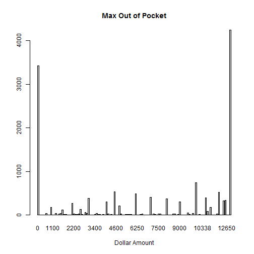
The scale is very bimodal. Very right and left censored. I see that the max value is 12700 and that over 4000 plans have that as their max out of pocket. After doing some research I find that $12,700 is the maximum value for MOOP in plans available through the ACA. Makes sense.
Now, I want to find out what the average MOOP is for each state that is contained in the dataset.
df <- aggregate(hc$MOOP, list(hc$StateCode), mean)
df
## Group.1 x
## 1 AK 7895.238
## 2 AL 7861.702
## 3 AR 7756.797
## 4 AZ 7242.531
## 5 DE 6350.588
## 6 FL 5706.446
## 7 GA 7593.617
## 8 IA 7450.909
## 9 ID 7509.278
## 10 IL 8240.188
## 11 IN 7738.820
## 12 KS 6594.808
## 13 LA 6854.647
## 14 ME 7305.755
## 15 MI 6297.267
## 16 MO 7071.164
## 17 MS 7516.127
## 18 MT 7775.789
## 19 NC 7743.648
## 20 ND 8026.667
## 21 NE 7861.867
## 22 NH 6695.349
## 23 NJ 7566.514
## 24 NM 8171.707
## 25 OH 7099.121
## 26 OK 7777.937
## 27 PA 7026.810
## 28 SC 4445.089
## 29 SD 7007.659
## 30 TN 6566.953
## 31 TX 7849.168
## 32 UT 7293.363
## 33 VA 7813.604
## 34 WI 6619.328
## 35 WV 6195.161
## 36 WY 7544.762Nice. Nothing looks like it’s out of place. Just want to rename my columns.
names(df) <- c("state", "moop")Now, I need to find a measure of ideology. Thankfully, Richard Fording has a dataset that contains a score for each state in the United States. The latest scores are for the year 2014, that’s why I only used that year in my earlier subsetting. There wasn’t a really good way to do this using R, so I just created the vector by hand.
Higher values is more liberal and lower values is more conservative. South Carolina has a score of 0. The most conservative state.
Full data avaialble here: https://rcfording.wordpress.com/state-ideology-data/
df$ideo <- c(35.44, 19.05, 48.89, 3.02, 76.58, 11.33, 3.12, 34.38, 8.78, 83.17, 10.24, 5.38, 14.02, 67.14, 11.17, 47.6, 26.71, 43.46, 6.65, 26.91, 15.68, 66.01, 54.12, 40.63, 11.85, 8.75, 27.45, 0, 22.85, 10.68, 6.97, 6.31, 51.35, 6.10, 72.81, 5.14)
df
## state moop ideo
## 1 AK 7895.238 35.44
## 2 AL 7861.702 19.05
## 3 AR 7756.797 48.89
## 4 AZ 7242.531 3.02
## 5 DE 6350.588 76.58
## 6 FL 5706.446 11.33
## 7 GA 7593.617 3.12
## 8 IA 7450.909 34.38
## 9 ID 7509.278 8.78
## 10 IL 8240.188 83.17
## 11 IN 7738.820 10.24
## 12 KS 6594.808 5.38
## 13 LA 6854.647 14.02
## 14 ME 7305.755 67.14
## 15 MI 6297.267 11.17
## 16 MO 7071.164 47.60
## 17 MS 7516.127 26.71
## 18 MT 7775.789 43.46
## 19 NC 7743.648 6.65
## 20 ND 8026.667 26.91
## 21 NE 7861.867 15.68
## 22 NH 6695.349 66.01
## 23 NJ 7566.514 54.12
## 24 NM 8171.707 40.63
## 25 OH 7099.121 11.85
## 26 OK 7777.937 8.75
## 27 PA 7026.810 27.45
## 28 SC 4445.089 0.00
## 29 SD 7007.659 22.85
## 30 TN 6566.953 10.68
## 31 TX 7849.168 6.97
## 32 UT 7293.363 6.31
## 33 VA 7813.604 51.35
## 34 WI 6619.328 6.10
## 35 WV 6195.161 72.81
## 36 WY 7544.762 5.14I want to use a nice theme for my visuals. I copied some code I found on Github that did a similar type of visualization using state abbreviations as markers.
https://github.com/apalbright/NewYorker/blob/master/scatter.R
my_theme <- function() {
# Define colors for the chart
palette <- brewer.pal("Greys", n=9)
color.background = palette[2]
color.grid.major = palette[4]
color.panel = palette[3]
color.axis.text = palette[9]
color.axis.title = palette[9]
color.title = palette[9]
# Create basic construction of chart
theme_bw(base_size=9, base_family="Georgia") +
# Set the entire chart region to a light gray color
theme(panel.background=element_rect(fill=color.panel, color=color.background)) +
theme(plot.background=element_rect(fill=color.background, color=color.background)) +
theme(panel.border=element_rect(color=color.background)) +
# Format grid
theme(panel.grid.major=element_line(color=color.grid.major,size=.25)) +
theme(panel.grid.minor=element_blank()) +
theme(axis.ticks=element_blank()) +
# Format legend
theme(legend.position="right") +
theme(legend.background = element_rect(fill=color.panel)) +
theme(legend.text = element_text(size=10,color=color.axis.title)) +
# Format title and axes labels these and tick marks
theme(plot.title=element_text(color=color.title, size=20, vjust=0.5, hjust=0, face="bold")) +
theme(axis.text.x=element_text(size=10,color=color.axis.text)) +
theme(axis.text.y=element_text(size=10,color=color.axis.text)) +
theme(axis.title.x=element_text(size=12,color=color.axis.title, vjust=-1, face="italic")) +
theme(axis.title.y=element_text(size=12,color=color.axis.title, vjust=1.8, face="italic")) +
# Plot margins
theme(plot.margin = unit(c(.5, .5, .5, .5), "cm"))
}
And now onto a visualization. I’m going to throw a regression line on the visualization just to give a sense of relationship.
ggplot(df, aes(x=moop, y=ideo))+
my_theme()+
geom_point(shape=1) +
geom_smooth(method=lm)+
labs(title= "", x="Max Out of Pocket for Family", y="State Ideology Scores")+
ggtitle(expression(atop(bold("Do Blue States Fare Better Under the ACA?"), atop(italic("Association between State Liberalism and Max Out of Pocket"),""))))+
geom_text(aes(label=state), vjust=-1, hjust=0.5, size=2)+
theme(plot.title = element_text(size = 16, face = "bold", colour = "black", vjust = 0.5, hjust=0.5))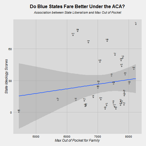
Looks like more liberal states actually have HIGHER overall MOOPs and more conservative states have LOWER MOOPs. However the relationship isn’t statistically significant.
I want to do the same thing for premiums. However, I need to load a new dataset.
rates <- read.csv("D:/HealthCare/Rate.csv", stringsAsFactors = FALSE)I need to do some subsetting to stay with 2014 as well as get rid of premiums that are clearly outliers.
rates <- subset(rates, BusinessYear == 2014)
rates <- subset(rates, IndividualRate <= 9000 )
Now I’m going to do something very similar to my previous analysis. Using the aggregate command to find the mean premium for each state.
df2 <- aggregate(rates$IndividualRate, list(rates$StateCode), mean)
names(df2) <- c("state", "rate")
df2
## state rate
## 1 AK 650.7317
## 2 AL 292.3891
## 3 AR 169.7941
## 4 AZ 350.4309
## 5 DE 280.9795
## 6 FL 218.4453
## 7 GA 236.2480
## 8 IA 341.8133
## 9 ID 318.5360
## 10 IL 379.0762
## 11 IN 467.1598
## 12 KS 262.5969
## 13 LA 382.3225
## 14 ME 351.8016
## 15 MI 276.0508
## 16 MO 150.4679
## 17 MS 318.3718
## 18 MT 246.7626
## 19 NC 343.6953
## 20 ND 305.5504
## 21 NE 317.8364
## 22 NH 277.3029
## 23 NJ 387.4788
## 24 NM 253.2623
## 25 OH 405.0188
## 26 OK 364.6755
## 27 PA 357.0630
## 28 SC 302.8206
## 29 SD 423.7412
## 30 TN 292.9453
## 31 TX 206.6470
## 32 UT 276.6910
## 33 VA 399.6042
## 34 WI 474.7037
## 35 WV 206.1048
## 36 WY 451.4465Looks good. Now I will merge this new dataframe with the previous one that I constructed.
total <- merge(df,df2,by=c("state"))
datatable(total, class = 'compact')
Perfect. Let’s do another visualization.
ggplot(total, aes(x=rate, y=ideo))+
my_theme()+
geom_point(shape=1) +
geom_smooth(method=lm)+
labs(title= "", x="Monthly Premium", y="State Ideology Scores")+
ggtitle(expression(atop(bold("Do Blue States Fare Better Under the ACA?"), atop(italic("Association between liberal scores and Health Insurance Premiums"),""))))+
geom_text(aes(label=state), vjust=-1, hjust=0.5, size=2)+
theme(plot.title = element_text(size = 16, face = "bold", colour = "black", vjust = 0.5, hjust=0.5))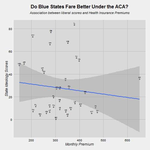
Here the relationship is a negative one. More liberal states do have lower monthly health insurance premiums, however this relationship isn’t statistically signficant, either.