
library(ggplot2)
library(dplyr)
library(foreign)
library(gridExtra)
library(RColorBrewer)
I want to take a deeper dive into how well Trump does with evangelical Protestants. Unfortunately, there isn’t a lot of publicly available data at the individual level. However, I have been able to cobble together a few different sources to find some county level data on Trump. Kaggle has posted election results from 25 states. And then a great resource, called the ARDA has hosted a dataset on county level religious adherence. I’m going to load both, then merge them. Finally, I will subset out just the Trump counties.
primary <- read.csv("D:/primary_results.csv", stringsAsFactors = FALSE)
census <- read.dta("D:/relcensus.dta", convert.factors = FALSE)
merge <- merge(census, primary, by=c("fips"))
trump <- subset(merge, candidate == "Donald Trump")
What I’m going to do is just run a scatterplot of Trump’s vote share on the X and the evangelical adherence rate on the Y. I am also going to plot a regression line with CIs to see if there is a relationship.
ggplot(trump, aes(x=fraction_votes, y=evanrate))+
my_theme()+
geom_point(shape=1) +
geom_smooth(method=lm)+
labs(title= "", x="Trump Vote Share", y="Evangelical Adherence Rate")+
ggtitle(expression(atop(bold("Trump and Evangelicals"), atop(italic("Association between Trump Vote Share and Evangelical Adherence"),""))))+
theme(plot.title = element_text(size = 16, face = "bold", colour = "black", vjust = 0.5, hjust=0.5))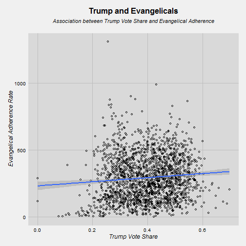
So the relationship is positive but very, very weak. That’s sort of disappointing. Let’s think about how to slice this a few different ways. I think a good approach is to break it down by regions of the country. That’s what I’m going to do.
midwest <- subset(trump, trump$state == "Illinois" | trump$state == "Iowa" | trump$state == "Michigan" | trump$state == "Missouri" | trump$state == "Ohio")

south <- subset(trump, trump$state == "Alabama" | trump$state == "Arkansas" | trump$state == "Florida" | trump$state == "Georgia" | trump$state == "Kentucky" | trump$state == "Louisiana" | trump$state == "Mississippi" | trump$state == "Tennessee" | trump$state == "Texas" | trump$state == "South Carolina")

west <- subset(trump, trump$state == "Arizona" | trump$state == "Nevada" | trump$state == "Utah" | trump$state == "Idaho")

east <- subset(trump, trump$state == "Massachusetts" | trump$state == "New Hampshire" | trump$state == "Vermont" | trump$state == "Virginia")
So, we’ve got our four regions now. Some of the states are sort of in-between. I’m thinking about places like Virginia and Oklahoma. I did the best I could.
g1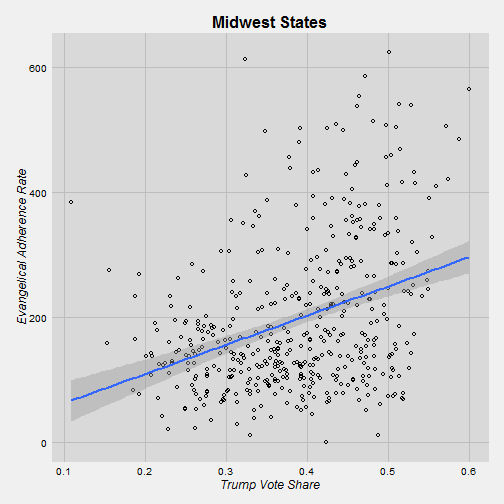
g2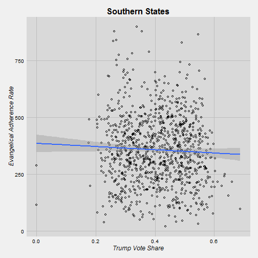
g3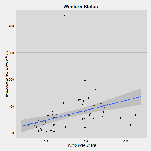
g4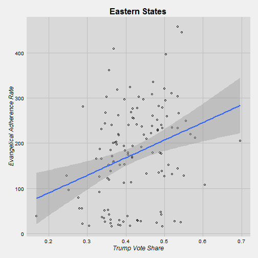
It’s interesting that Trump does not better in Southern counties that are more evangelical. Maybe conservatism is so widespread that evangelicalism doesn’t matter in that situation. On the other hand, in the other regions there is a positive relationship between evangelicalism and Trump’s vote share. I would say that we can say that the relationship is strong in the Midwest because we have a large number of counties in our sample. In the West and East we don’t have a huge sample.
Again, this is county level data so we can’t say how individuals vote for Trump, but this is a good broad view.