
library(ggplot2)
library(readr)
library(dplyr)
library(choroplethr)
library(extrafont)
library(extrafontdb)
library(RColorBrewer)
The Affordable Care Act is a huge step forward for people who were previously uninsured, but what could happen if someone who is covered by an ACA plan gets cancer? Most likely they will have to get some sort of chemotherapy. That’s called an “Infusion Therapy” in medical speak. I wanted to take a look at how insurance companies pay for that. Note: this analysis has nothing to do with the cost of the actual chemo drugs. That’s a completely different charge.
setwd("D:/HealthCare")
hc <- read.csv("BenefitsCostSharing.csv", stringsAsFactors = FALSE)
head(hc$BenefitName, 50)
## [1] "Routine Dental Services (Adult)" "Dental Check-Up for Children"
## [3] "Basic Dental Care - Child" "Orthodontia - Child"
## [5] "Major Dental Care - Child" "Basic Dental Care - Adult"
## [7] "Orthodontia - Adult" "Major Dental Care - Adult"
## [9] "Accidental Dental" "Routine Dental Services (Adult)"
## [11] "Dental Check-Up for Children" "Basic Dental Care - Child"
## [13] "Orthodontia - Child" "Major Dental Care - Child"
## [15] "Basic Dental Care - Adult" "Orthodontia - Adult"
## [17] "Major Dental Care - Adult" "Accidental Dental"
## [19] "Routine Dental Services (Adult)" "Dental Check-Up for Children"
## [21] "Basic Dental Care - Child" "Orthodontia - Child"
## [23] "Major Dental Care - Child" "Basic Dental Care - Adult"
## [25] "Orthodontia - Adult" "Major Dental Care - Adult"
## [27] "Accidental Dental" "Routine Dental Services (Adult)"
## [29] "Dental Check-Up for Children" "Basic Dental Care - Child"
## [31] "Orthodontia - Child" "Major Dental Care - Child"
## [33] "Basic Dental Care - Adult" "Orthodontia - Adult"
## [35] "Major Dental Care - Adult" "Accidental Dental"
## [37] "Routine Dental Services (Adult)" "Dental Check-Up for Children"
## [39] "Basic Dental Care - Child" "Orthodontia - Child"
## [41] "Major Dental Care - Child" "Basic Dental Care - Adult"
## [43] "Orthodontia - Adult" "Major Dental Care - Adult"
## [45] "Accidental Dental" "Routine Dental Services (Adult)"
## [47] "Dental Check-Up for Children" "Basic Dental Care - Child"
## [49] "Orthodontia - Child" "Major Dental Care - Child"So, what I’m specifically looking for is the line item about “Infusion Therapy”, I’m going to subset my huge dataset to just look at those lines.
infuse <- subset(hc, BenefitName == "Infusion Therapy")
dim(infuse)
## [1] 65704 32That’s still a lot of lines, 65704. I’m going to clean up the coinsurance column and then do a visualization.
infuse$coins <- gsub('%', '', infuse$CoinsInnTier1)
infuse$coins <- as.numeric(infuse$coins)
infuse$coins[is.na(infuse$coins)] <- 0
qplot(coins, data=infuse, geom="bar", xlab = "Insurance Company", ylab="Number of Plans", main = "Health Insurers with Infusion Co-Pays of 50%") + theme(text=element_text(size=16, family="Georgia"))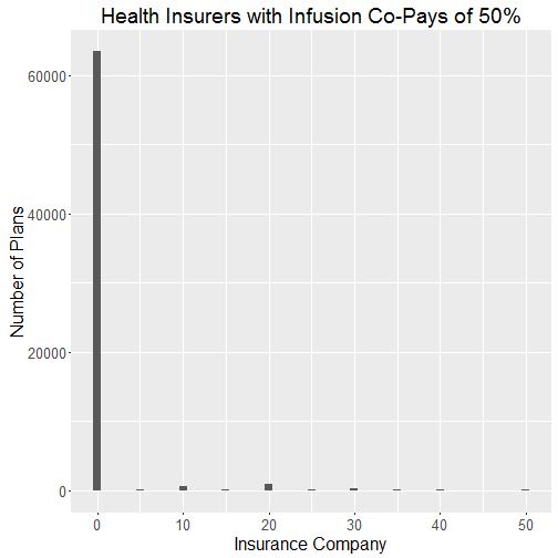
So, there are a lot of plans that fall in the zero category. Those plans either have a 0% co-pay or just a flat fee for each infusion and therefore don’t have a copay. That’s problematic. I’m just going to have to dump those plans out to get a better look at what a typical copay looks like.
inf <- subset(infuse, coins > 0)I want to map this, so I can get a good idea of how different states fare. I will use the choroplethr package which I loaded earlier. I need to figure out the mean copay for each state and then put it in the proper format for the package to read it. I’m going to use a function I found online to convert state abbreviations to their full names. The link for that is: https://favorableoutcomes.wordpress.com/2012/10/19/create-an-r-function-to-convert-state-codes-to-full-state-name/
df <- aggregate(inf$coins, list(inf$StateCode), mean)
df$region<-stateFromLower(df$Group.1)
df$value <- df$x
choro = StateChoropleth$new(df)
choro$title = "Average CoPay for Infusion Services"
choro$set_num_colors(1)
myPalette <- colorRampPalette(brewer.pal(9, "Reds"))
choro$ggplot_polygon = geom_polygon(aes(fill = value), color = NA)
choro$ggplot_scale = scale_fill_gradientn(name = "CoPay", colours = myPalette(9))
choro$render()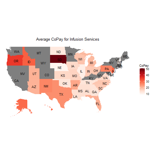
I just want to look at the plans that offer terrible coverage for infusions. It looks like the worst are those that make customers pay a 50% copay for infusions. I will create a subset for that.
highinf <- subset(infuse, coins == "50")
dim(highinf)
## [1] 159 33159 plans fit the bill. That’s a lot. Maybe there has been some sort of trend over time. Hopefully those plans have become fewer since the ACA fully rolled out.
qplot(BusinessYear, data=highinf, geom="bar", fill=StateCode, xlab = "Business Year", ylab="Number of Plans", main = "Health Insurers with Infusion Co-Pays of 50%") + theme(text=element_text(size=16, family="Georgia"))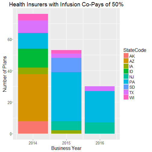
The trend is good. The total number of plans that require a 50% copay has dropped pretty significantly. There were 76 in 2014, 53 in 2015, and 30 in 2016. Looks like Pennsylvania is a bad state to be in if you need chemotherapy. Many other states have completed exited the dataset in 2016 though. Arizon was a huge share in 2014 and now they have no plans with a 50% co-pay.