
Kobe Bryant’s Success Against Different Opponents and Throughout His Career
library(ggplot2) # Data visualization
library(readr) # CSV file I/O, e.g. the read_csv function
library(dplyr)
library(DT)
kobe <- read.csv("D:/kobe/kobe.csv", stringsAsFactors = FALSE)I want to do some quick and broad data exploration to see if Kobe is a better shooter against certain opponents.
I need to take a look at the important variable first, kobe$shot_made_flag.
head(kobe$shot_made_flag, 50)## [1] NA 0 1 0 1 0 1 NA 1 0 0 1 1 0 0 0 NA 1 0 NA 0 0 1
## [24] 1 1 0 0 0 0 0 1 0 NA NA NA NA NA NA 1 1 0 1 1 0 NA 1
## [47] 0 1 1 NAThere are a lot of NAs in there, that will make this difficult so I am just going to ignore them for this analysis, I don’t think it can make a huge difference in the final analysis.
team <- aggregate(kobe$shot_made_flag, list(kobe$opponent), na.rm = TRUE, mean)
team <- arrange(team, x)
head(team, 33)
## Group.1 x
## 1 BKN 0.4000000
## 2 IND 0.4009585
## 3 NOP 0.4076655
## 4 MIL 0.4102564
## 5 BOS 0.4112388
## 6 OKC 0.4188948
## 7 WAS 0.4271457
## 8 MIA 0.4294004
## 9 CHI 0.4302326
## 10 HOU 0.4345961
## 11 ORL 0.4354305
## 12 CHA 0.4360000
## 13 NJN 0.4360190
## 14 SAS 0.4365079
## 15 CLE 0.4396887
## 16 DET 0.4412266
## 17 UTA 0.4442649
## 18 MIN 0.4446267
## 19 PHI 0.4494196
## 20 MEM 0.4500574
## 21 NOH 0.4505263
## 22 ATL 0.4520548
## 23 SEA 0.4524496
## 24 DAL 0.4540174
## 25 DEN 0.4578402
## 26 LAC 0.4608939
## 27 TOR 0.4640288
## 28 PHX 0.4644951
## 29 GSW 0.4645669
## 30 POR 0.4651703
## 31 SAC 0.4652827
## 32 VAN 0.4705882
## 33 NYK 0.4770318So, I’ve got what I need now. A smaller dataframe with just the opponents name and Kobe’s shooting percentage against them. I want to add a little extra analysis, so I am going to create a vector that lists the conferences of each opponent. There’s not an easy way to do this, so I will just do it by hand.
team$conference <- c("Eastern", "Eastern", "Western", "Eastern", "Eastern" ,"Western", "Eastern", "Eastern" , "Eastern" , "Western" , "Eastern", "Eastern", "Eastern", "Eastern" , "Western" , "Eastern", "Eastern", "Western", "Western", "Eastern", "Western" , "Eastern", "Eastern", "Western", "Western", "Western", "Western" , "Western", "Western", "Western", "Western", "Western", "Eastern" )Looks good so let’s plot. I want this to be plotted in order of best shooting percentage to worst shooting percentage. I am also going to add in a horizontal line indicating Kobe’s overall shooting percentage, which is 43.9%.
ggplot(team, aes(x=reorder(Group.1, -x), y = x)) + geom_bar(aes(fill=conference),stat="identity") + ylim(0,.5) + theme(axis.text.x = element_text(angle = 90)) + xlab("Opponent's Name") + ylab("Shooting Percentage") + geom_hline(yintercept = .43)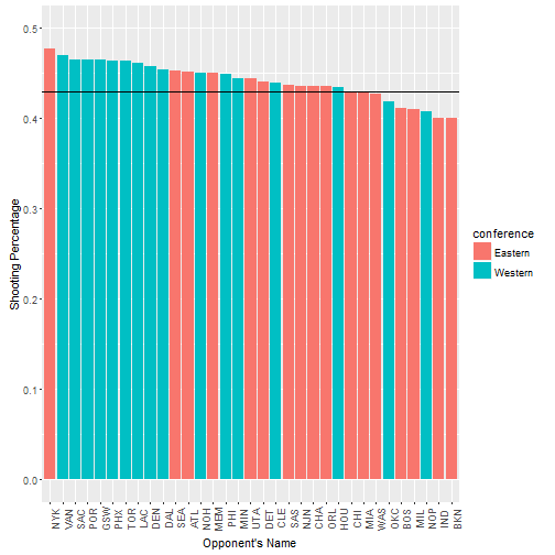
So there’s something interesting. Kobe shoots better against the Western conference than the Eastern Conference. That may be an interesting feature to use.
I also want to see if Kobe really declined near the end of his career. I know that he tore his Achilles and missed a lot of time. Again, I’m adding a line to indicate Kobe’s lifetime shooting percentage.
season <- aggregate(kobe$shot_made_flag, list(kobe$season), na.rm = TRUE, mean)
ggplot(season, aes(x=Group.1, y = x)) + geom_bar(stat="identity")  + ylim(0,.5) + theme(axis.text.x = element_text(angle = 90, hjust = 1)) + xlab("Season") + ylab("Shooting Percentage") + geom_hline(yintercept = .43)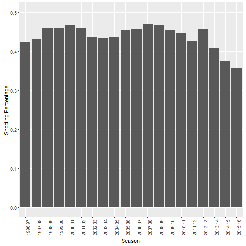
Yeah, it’s pretty clear that Kobe was really consistent for a long period of time. He was a very consistent shooter from 1996 to 2013-2014. The last three years were ugly with his shooting percentage doropping pretty significantly near the end.
Here’s a quick data table to show that decline in a different format.
datatable(season, class = 'compact')Those last three years are pretty brutal. 40.6%, 37.6%, and 35.6%. Much lower than Kobe was used to. He knew he was in terminal decline and decided to retire.