
library(ggplot2)
library(readr)
library(dplyr)
library(choroplethr)
library(extrafont)
library(extrafontdb)
library(RColorBrewer)
library(scales)
library(gridExtra)
Read in my data.
hc1 <- read.csv("D:/HealthCare/PlanAttributes.csv", stringsAsFactors = FALSE)The real test of how good a healthcare plan is can be difficult to assess, but one very crude benchmark is the maximum out of pocket. In layman’s terms, that’s the maximum a subscriber has to pay if the absolute worst happens. In this case, I’m looking at family MOOP. Say a family slid off the road during a snow storm and several people got hurt, they needed expensive surgery and rehab. The max out of pocket is the amount of money that the family would have to pay before the insurance covers everything 100%. I want to take a look at that number.
Here’s a quick glimpse and then some data cleaning.
head(hc1$TEHBInnTier1FamilyMOOP, 50)## [1] "" "" "" "" "" "" "$12,700"
## [8] "$8,000" "$8,000" "$12,700" "$0" "$9,500" "$12,000" "$0"
## [15] "" "" "" "$9,500" "$12,000" "$12,700" "$12,700"
## [22] "$0" "" "" "" "" "" "$12,700"
## [29] "$12,000" "$9,500" "$12,000" "$12,700" "$10,400" "$2,500" "$1,000"
## [36] "" "$9,500" "$0" "$12,700" "$10,400" "$2,500" "$1,000"
## [43] "$12,700" "" "" "" "" "" ""
## [50] ""hc1$TEHBInnTier1FamilyMOOP<- gsub(',', '', hc1$TEHBInnTier1FamilyMOOP)
hc1$TEHBInnTier1FamilyMOOP<- gsub('\\$', '', hc1$TEHBInnTier1FamilyMOOP)
hc1$moop<- as.numeric(hc1$TEHBInnTier1FamilyMOOP)
hc1$moop[is.na(hc1$moop)] <- 0
ggplot(hc1, aes(x = hc1$moop)) + geom_histogram()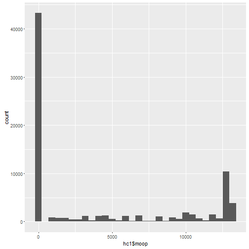
There’s a lot of plans in there that have a zero family MOOP. That’s not accurate. I will only stick to plans that actually have a dollar amount.
moop <- subset(hc1, moop > 0)I’m going to map this to see which states have the worst MOOP on average for a family. I used a function that turns state abbreviations to a format that choropleth can actually use.
df <- aggregate(hc1$moop, list(hc1$StateCode), mean)
df$region<-stateFromLower(df$Group.1)
df$value <- df$x
choro = StateChoropleth$new(df)
choro$title = "Average Max Out of Pocket"
choro$set_num_colors(1)
myPalette <- colorRampPalette(brewer.pal(9, "Reds"))
choro$ggplot_polygon = geom_polygon(aes(fill = value), color = NA)
choro$ggplot_scale = scale_fill_gradientn(name = "MOOP", colours = myPalette(9))
choro$render()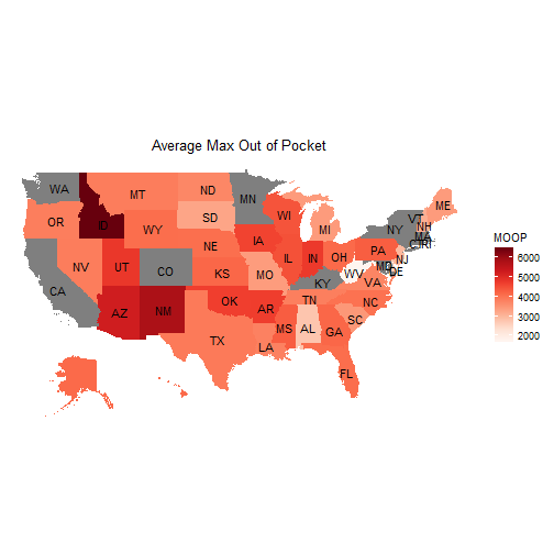
Idaho is easily the worst. Along with Arizona and New Mexico. Things look pretty uniform throughout the rest of the country, however. I want to look how MOOP has changed over time as well. I only have two years for the ACA: 2014 and 2015. I would like to see if MOOP has gotten higher.
moop14 <- subset(moop, BusinessYear == "2014")
dim(moop14)
## [1] 11763 177moop15 <- subset(moop, BusinessYear == "2015")
dim(moop15)## [1] 22314 177One thing to note here: there are LOTS more total plans in 2015. Almost twice as many, actually. That means I need to think about how to display this visually so I don’t mislead.
table(moop14$moop)##
## 400 500 600 700 800 900 950 1000 1100 1150 1200 1240
## 2 1 1 2 40 3 3 178 5 8 39 1
## 1300 1400 1500 1508 1600 1660 1700 1900 2000 2200 2300 2350
## 29 44 115 16 12 4 5 1 266 25 14 12
## 2400 2500 2600 2700 2800 2900 3000 3100 3200 3300 3400 3500
## 29 126 14 6 65 39 385 2 1 4 20 35
## 3600 3700 3750 3800 3900 4000 4200 4230 4300 4400 4500 4600
## 13 14 1 19 1 302 30 8 12 9 533 6
## 4700 5000 5200 5300 5350 5400 5500 5600 5800 5840 5900 6000
## 5 212 28 7 10 12 19 13 12 3 2 485
## 6250 6300 6400 6500 6600 6750 6800 6900 7000 7050 7200 7300
## 2 3 21 24 2 1 4 2 409 10 26 16
## 7400 7500 7600 7700 7800 7900 8000 8200 8250 8300 8400 8500
## 8 22 27 1 2 4 380 5 8 3 30 23
## 8700 8800 9000 9100 9200 9300 9400 9500 9600 9700 9750 9800
## 3 16 303 4 4 4 6 56 13 3 42 10
## 10000 10160 10200 10300 10338 10360 10400 10500 10600 11000 11200 11400
## 741 4 18 2 4 4 402 83 7 181 2 2
## 11500 11600 12000 12200 12400 12500 12600 12650 12675 12700
## 10 31 530 4 2 332 341 3 2 4253table(moop15$moop)##
## 300 400 500 700 800 850 900 950 1000 1050 1100 1150
## 1 4 1 3 51 2 17 6 469 10 43 8
## 1200 1240 1250 1300 1350 1400 1450 1500 1508 1520 1600 1650
## 100 1 1 46 4 64 3 263 23 2 15 2
## 1660 1700 1750 1800 1900 2000 2100 2200 2300 2400 2500 2600
## 2 10 2 1 1 387 1 40 21 52 143 36
## 2700 2800 2900 2950 3000 3050 3100 3200 3250 3300 3400 3450
## 24 82 174 1 688 1 5 23 3 10 24 1
## 3500 3600 3650 3700 3750 3800 3850 3900 4000 4100 4150 4200
## 62 47 1 47 9 12 2 11 691 6 4 88
## 4250 4300 4400 4500 4600 4800 5000 5100 5200 5300 5350 5400
## 6 12 23 668 9 15 232 5 29 20 2 9
## 5500 5600 5800 5840 5900 6000 6150 6200 6250 6350 6400 6500
## 98 50 25 6 4 611 3 9 4 3 16 33
## 6600 6700 6750 6800 6900 6950 7000 7050 7100 7200 7300 7400
## 17 6 2 7 9 2 835 6 1 50 33 9
## 7450 7500 7600 7650 7700 7800 7850 7900 8000 8100 8150 8200
## 4 15 53 2 1 10 2 10 593 2 1 16
## 8250 8300 8400 8500 8600 8700 8800 8850 8900 9000 9050 9100
## 13 7 39 99 1 5 17 2 1 451 1 6
## 9150 9200 9300 9400 9450 9500 9600 9650 9700 9750 9800 9850
## 1 64 12 27 1 79 31 2 42 229 25 5
## 9900 9950 10000 10050 10100 10200 10300 10338 10360 10400 10500 10600
## 9 3 1053 2 2 46 6 4 4 668 283 19
## 10700 10800 10850 10950 11000 11050 11100 11150 11200 11250 11300 11400
## 3 9 3 8 435 3 6 2 12 2 126 18
## 11450 11500 11550 11600 11700 11750 11800 11900 12000 12050 12200 12400
## 5 46 3 40 2 3 18 6 963 3 7 17
## 12450 12500 12550 12600 12650 12700 12800 12900 13000 13100 13200
## 3 304 3 558 3 4558 108 559 391 9 3390Now, this is where things get very interesting. The max MOOP in 2014 was $12,700 and there are many plans with that MOOP. 4253 in total. That’s about a third of all plans at the max MOOP. But then in 2015 things change. The max MOOP goes up to $13,200. And now many plans have higher MOOPs. Now over 9000 plans have family MOOPs of $12,700+. That’s a huge increase. As the MOOP ceiling has gone up, health insurers have moved their MOOP up as well. That’s a worrying trend.
Remebering that the difference between the total count of plans in 2014 and 2015 is large, I don’t want to use raw numbers. Instead, I want to use percentages to display the information in a way that makes sense.
g1<-ggplot(moop14, aes(x = moop14$moop)) +
geom_histogram(aes(y = (..count..)/sum(..count..)), binwidth = 500, col= "red", fill= "blue") +
## version 3.0.9
# scale_y_continuous(labels = percent_format())
## version 3.1.0
scale_y_continuous(labels=percent) + labs(title = "MOOP in 2014") + labs(x="Family MOOP", y= "Percent of Total Plans") +  theme(text=element_text(size=16, family="Georgia"))
g2 <- ggplot(moop15, aes(x = moop15$moop)) +
geom_histogram(aes(y = (..count..)/sum(..count..)), binwidth = 500, col= "red", fill= "blue") +
## version 3.0.9
# scale_y_continuous(labels = percent_format())
## version 3.1.0
scale_y_continuous(labels=percent) + labs(title = "MOOP in 2015") + labs(x="Family MOOP", y= "Percent of Total Plans") +  theme(text=element_text(size=16, family="Georgia"))
grid.arrange(g1, g2, ncol = 2)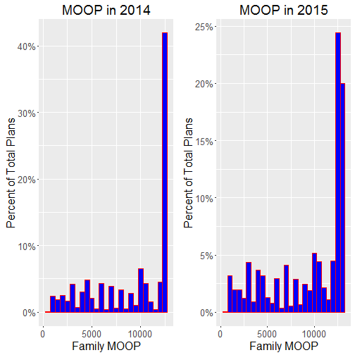
While the ACA has obviously been a huge benefit to families who need it, it’s a little scary to note that that many plans offer the poorest coverage possible under the ACA. It will be interesting to see what happens over the next five years. Will HHS keep allowing MOOP to rise or will they push back? If this data is any indication, health insurers will continue to raise MOOP if they are allowed.