
#install.packages("ggplot2")
#install.packages("dplyr")
#install.pacakges("car")
#install.packages("Rmisc")
#install.packages("corrplot")
library(ggplot2)
library(dplyr)
library(car)
library(Rmisc)
library(corrplot)
Load in your data
The below command will load in your data and call it “simon”
The codebook for this data is here
simon <- read.csv(url("http://goo.gl/exQA14"))What does a T-Test do?
So, let’s say that I have two groups, for instance in the Simon poll there are 3 geographic groups (Chicago, Suburbs, Downstate). Do they have the same political affiliation?
Let’s start by using our trusty filter command to compare two groups: City of Chicago folks and suburbans folks.
city <- filter(simon, area == 1)
downstate <- filter(simon, area == 3)
Now I have 2 smaller datasets. Let’s see if they are actually different on an important measure: political affiliation. It’s easy enough to figure out the means of those two things.
mean(city$party_leans)## [1] 3.475mean(downstate$party_leans)## [1] 4.423333You can see that the downstate folks have a mean of 4.42 and the city people have a mean of 3.48. But are those things actually outside the margin of error of each other. The way that we can figure that out manually is to see the confidence intervals of each of the two samples. What is the highest the mean could be? And what the lowest the mean can be? Let’s use R to figure that out.
CI(city$party_leans)## upper mean lower
## 3.816821 3.475000 3.133179CI(downstate$party_leans)## upper mean lower
## 4.690499 4.423333 4.156168So, we find something pretty interesting here. The actual mean party affiliation of city of Chicago people can be anywhere between 3.13 and 3.81. The range for the downstate people is a low of 4.15 and a high range of 4.69. So does the upper limit of city of chicago actually overlaps with the lower limit of the downstate sample. You know what that means? There is a statistically significant difference between the two groups.
Let me visualize that for you.
ci <- read.csv("D:/tutorials/ci.csv")
ggplot(ci, aes(x=mean, y=cluster, colour=factor)) + geom_point() + geom_errorbarh(aes(xmin = lo, xmax=hi), height=0) + theme(axis.title.y=element_blank(),
axis.text.y=element_blank(),
axis.ticks=element_blank() ) +
labs(x="Party Affiliation") + theme(legend.title=element_blank()) + theme(legend.position = "bottom") 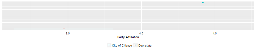 Just ignore that syntax for now. I had to do some trickery to make this plot correctly. But you do see what I just described? The red horizontal line of City of Chicago does NOT overlaps the blue line of downstate. So let’s see what our t.test tells us.
t.test(city$party_leans, downstate$party_leans)##
## Welch Two Sample t-test
##
## data: city$party_leans and downstate$party_leans
## t = -4.3071, df = 414.27, p-value = 2.067e-05
## alternative hypothesis: true difference in means is not equal to 0
## 95 percent confidence interval:
## -1.3811365 -0.5155302
## sample estimates:
## mean of x mean of y
## 3.475000 4.423333Because the p-value is greater than .05 we can say that these two samples have statistically distinct means.
Let’s compare city of chicago people with suburban people
suburbs <- filter(simon, area ==2)
t.test(city$party_leans, suburbs$party_leans)
##
## Welch Two Sample t-test
##
## data: city$party_leans and suburbs$party_leans
## t = -2.3635, df = 372.02, p-value = 0.01862
## alternative hypothesis: true difference in means is not equal to 0
## 95 percent confidence interval:
## -0.89217082 -0.08182918
## sample estimates:
## mean of x mean of y
## 3.475 3.962Here the p-value is less than .05 and therefore there is no statistically significant difference in the means of the Chicago sample and suburban sample. Let me chart that to show it.
ci <- read.csv("D:/tutorials/ci2.csv")
ggplot(ci, aes(x=mean, y=cluster, colour=factor)) + geom_point() + geom_errorbarh(aes(xmin = lo, xmax=hi), height=0) + theme(axis.title.y=element_blank(),
axis.text.y=element_blank(),
axis.ticks=element_blank() ) +
labs(x="Party Affiliation") + theme(legend.title=element_blank()) + theme(legend.position = "bottom") 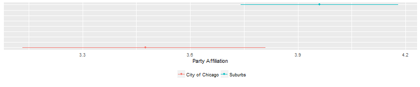 See how the right side of the red line overlaps with the left side of the blue line? No statistically significant difference between the samples.
Let’s just throw all three in one graph to take a look.
ci <- read.csv("D:/tutorials/ci3.csv")
ggplot(ci, aes(x=mean, y=cluster, colour=factor)) + geom_point() + geom_errorbarh(aes(xmin = lo, xmax=hi), height=0) + theme(axis.title.y=element_blank(),
           axis.text.y=element_blank(),
           axis.ticks=element_blank() ) +
labs(x="Party Affiliation") + theme(legend.title=element_blank()) + theme(legend.position = "bottom") 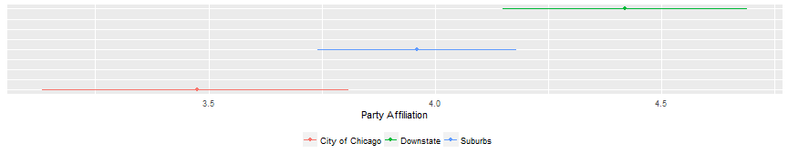
Kind of what you would expect, right? Downstate is most conservative. City of Chicago is most liberal. Suburbs are in the middle.
Correlations
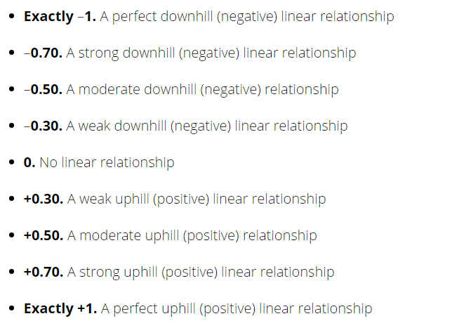
A correlation is a good place to start if you want to see if there is a basic relationship between two variables. Do they move in a positive direction or a negative direction? If so strong is that relationship. Correlations are scored between -1 and +1. 0 means there is absolutely no systematic relationship between the two variables.
The syntax for a basic correlation is simple.
cor(simon$rwdirusa, simon$rwdiril)## [1] 0.08777552There is a positive relationship between these two variables, but it’s pretty weak. Here’s how to interpret a correlation coefficient.
Instead of just trying to random variables, let’s do a whole bunch at one time using the corrplot package. I’m going to do two things. First, I am going to make a small dataset out of the simon data by using the “select” command from the dplyr package. Then I am going to use that smaller dataset to look for correlations.
corr_simon <- select(simon, type, app_gov_rau, app_ussen_kirk, app_ussen_dur, cuts_K12, cuts_he, cuts_cops, cuts_parks, cuts_poor, pen_cuts, relig_att_often, gender, education, ideo_leans, union, age_cat, rac_eth, hhinc)

M <- cor(corr_simon)
corrplot(M, method = "circle")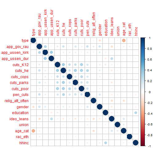
Here’s what you are seeing here. I did some correlations between a lot of variables in the dataset to see if there was anything that was decently correlated. The larger and darker the circle. The more correlation exists. As you can see, there isn’t much. One negative correlation is between age_cat and type. Type is either cell phone or land line, age_cat is age category. You know what that tells us? Older people are more likely to use land lines! Shocking. You do see a nice little square of blue in the middle of the matrix. It’s all related to the “cutting services” questions. If someone is willing to cut one service, they are more likely to cut another service. There’s also a small relationship between household income and education. Let’s look at that in another form.
corrplot(M, method = "number")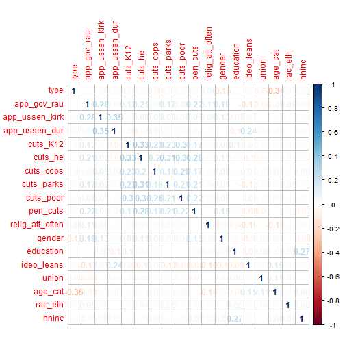
So, instead of just circles, this gives us numbers. You can see them a lot of them are in the .2 range. How do you determine what’s a strong correlation? There is a general rule of thumb.
So, you can see that most of the stuff in this example has a weak relationship at best.
Let me drill down on one simple example. What’s the relationship between age and income?
simon$age <- 2016 - simon$birth_yr
cor(simon$age, simon$hhinc)
## [1] 0.1098817So, using our interpretation table from earlier. That’s a mild positive relationship.
Let’s visualize that.
ggplot(simon, aes(x=age, y=hhinc)) + geom_point(shape =1, position=position_jitter(width=1,height=1)) + geom_smooth(method=lm)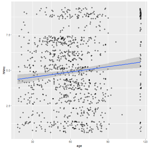
The blue line you see is the correlation between the two variables. See all those vertical dots on the far right? Those are people who refused to tell their age. You see how the line does get a little bit higher as it goes further to the right? That’s the postive correlation. Let me show you something that’s very important, though. Let’s clean this data up.
simon$age[simon$age ==116] <- NA
simon$hhinc[simon$hhinc == 9] <- NA
cor(simon$age, simon$hhinc, use="pairwise.complete.obs")
## [1] -0.1030068ggplot(simon, aes(x=age, y=hhinc)) + geom_point(shape =1, position=position_jitter(width=1,height=1)) + geom_smooth(method=lm)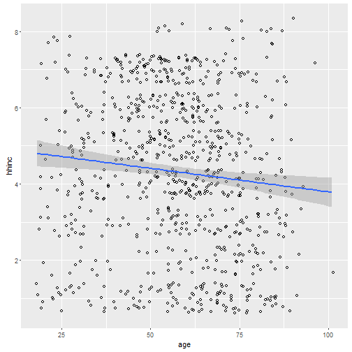
All I did was clean the data. People who refused to answer questions got marked as NA. Then I just did a simple correlation and the plotted. Do you see the difference now? There is actually a slightly negative relationship between the two variables. CLEANING DATA IS IMPORTANT!!!
LOESS Smoothing
One last thing. In the previous graphs I forced the line to be straight, because a correlation doesn’t vary across the sample. What would happen if we allowed the line to really follow the trend of the data?
ggplot(simon, aes(x=age, y=hhinc)) + geom_point(shape =1, position=position_jitter(width=1,height=1)) + geom_smooth()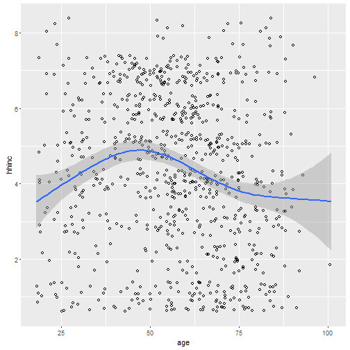
When do you have the highest income? Somewhere in your late thirties and into your late forties. Then income goes back down.