
devtools::install_github("abresler/forbesListR")
library(forbesListR)
library(tidyr)
library(dplyr)
library(ggplot2)
Fortune Lists
One of the awesome things about R is that anyone can write a package for it to grab some data. Fortune Magazine publishes all sorts of lists that were hard to grab for a long time. Then, I was browsing reddit one day and found that someone had written a little package to hook into the Fortune API to grab the list data and I had to give it a try.
vcs_2012_2016 <-get_years_forbes_list_data(years = 2012:2016, list_name = "Top VCs")
head(vcs_2012_2016)
## Source: local data frame [6 x 16]
##
## year list name last_name company
## (int) (chr) (chr) (chr) (chr)
## 1 2016 Top VCs Jim Goetz Goetz Sequoia Capital
## 2 2016 Top VCs Steve Anderson Anderson Baseline Ventures
## 3 2016 Top VCs Chris Sacca Sacca Lowercase Capital
## 4 2016 Top VCs Peter Fenton Fenton Benchmark
## 5 2016 Top VCs Mary Meeker Meeker Kleiner Perkins Caufield & Byers
## 6 2016 Top VCs Josh Kopelman Kopelman First Round Capital
## Variables not shown: is.government (lgl), position (int), rank (int), age
## (int), squareImage (chr), url.bio.forbes (chr), url.image (chr), gender
## (chr), country (chr), description (chr), notableDeal (chr)I just want to do some quick gender and country analysis.
ggplot(vcs_2012_2016, aes(year, fill=gender)) + geom_bar()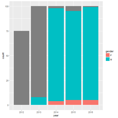
ggplot(vcs_2012_2016, aes(year, fill=country)) + geom_bar()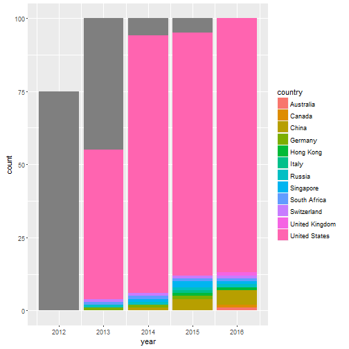
Couple things here. First, there are a lot of NAs early on. I can’t do much about that. Two results are apparent. Top VCs are almost always men. And a huge share are American men.
vc16 <- subset(vcs_2012_2016, year == 2016)
vc15 <- subset(vcs_2012_2016, year == 2015)
vc14 <- subset(vcs_2012_2016, year == 2014)
vc13 <- subset(vcs_2012_2016, year == 2013)
vc12 <- subset(vcs_2012_2016, year == 2012)
vc15 <- select(vc15, year, name, rank)
vc14 <- select(vc14, year, name, rank)
vc13 <- select(vc13, year, name, rank)
vc12 <- select(vc12, year, name, rank)
vc2012 <- head(vc12, -25)
vc13 <- head(vc13, -25)
vc14 <- head(vc14, -25)
vc15 <- head(vc15, -25)
vc16 <- head(vc16, -25)
df <- rbind(vc12, vc13, vc14, vc15)
rank <- aggregate(df$rank, list(df$name), sum)
rank$name <- rank$Group.1
rank$Group.1 <- NULL
summary(rank$x)
## Min. 1st Qu. Median Mean 3rd Qu. Max. NA's
## 16.00 59.50 83.50 95.25 119.80 234.00 1I want to visualize how rankings change over time but I can’t plot every single VC that shows up on the Fortune list. So, I want to just subset those. I will only plot those whose ranking slightly below the median over the five years of the list.
merge <- merge(vcs_2012_2016, rank, by=c("name"))
merge <- subset(merge, x <= 65)
p <- ggplot(merge, aes(factor(year), rank,
group = name, colour = name, label = name))
p1 <- p + geom_line(size=1.25) + geom_text(data = subset(merge,
year == "2016"), aes(x = factor(year +
0.5)), size = 3.5, hjust = 0.8)
p1 + theme_bw() + theme(legend.position = "none",
panel.border = element_blank(), axis.ticks = element_blank()) + xlab(NULL) + ylab(NULL) + scale_y_reverse( lim=c(100,0))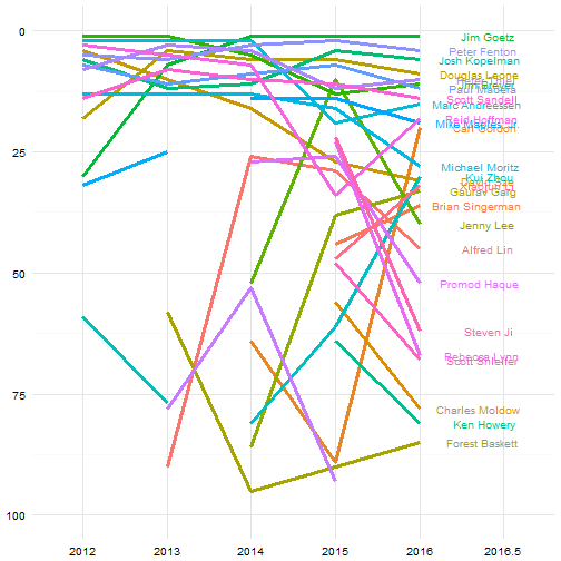
The visual is pretty noisy, but it’s a lot of names to plot and some of the changes are pretty dramatic. It’s interesting to see how the top VCs have stayed that way for basically the entire history of the list. There is a lot more significant changes in rankings once you get below rank 25 or so.