
library(ggplot2)
table <- read.csv("D:/table.csv", stringsAsFactors = FALSE)
All I did there was load in ggplot2 and then load in my data into a dataset called “table”
There’s a link to the data here
head(table)## Code Agency Appropriated Expended.YTD
## 1 676 UNIVERSITY OF ILLINOIS $350,599,000.00 $278,180,288.41
## 2 664 SOUTHERN IL UNIVERSITY $106,156,000.00 $106,123,726.80
## 3 644 NORTHERN IL UNIVERSITY $48,293,000.00 $48,187,561.01
## 4 636 ILLINOIS STATE UNIVERSITY $38,291,000.00 $38,232,065.81
## 5 628 WESTERN IL UNIVERSITY $31,389,000.00 $31,388,984.95
## 6 612 EASTERN IL UNIVERSITY $26,222,000.00 $13,625,751.68
## Jul Aug Sep Oct Nov Dec
## 1 $52,107,615.06 $138,264.19 $225,934,409.16 $0.00 $0.00 $0.00
## 2 $12,865,996.99 $93,063,842.33 $193,887.48 $0.00 $0.00 $0.00
## 3 $48,158,000.00 $11,948.93 $17,612.08 $0.00 $0.00 $0.00
## 4 $38,215,378.90 $5,448.37 $11,238.54 $0.00 $0.00 $0.00
## 5 $14,994,121.25 $15,477,361.79 $917,501.91 $0.00 $0.00 $0.00
## 6 $6,125,882.69 $3,007,007.49 $4,492,861.50 $0.00 $0.00 $0.00
## Jan Feb Mar Apr May Jun Unexpended
## 1 $0.00 $0.00 $0.00 $0.00 $0.00 $0.00 $72,418,711.59
## 2 $0.00 $0.00 $0.00 $0.00 $0.00 $0.00 $32,273.20
## 3 $0.00 $0.00 $0.00 $0.00 $0.00 $0.00 $105,438.99
## 4 $0.00 $0.00 $0.00 $0.00 $0.00 $0.00 $58,934.19
## 5 $0.00 $0.00 $0.00 $0.00 $0.00 $0.00 $15.05
## 6 $0.00 $0.00 $0.00 $0.00 $0.00 $0.00 $12,596,248.32Now, we’ve got a problem. Both the appropriated column and the unexpended column have quotation marks around them. That’s because R doesn’t seem them as numbers, it sees them as a character string. A big reason why is because there is a dollar sign and commmas in each of those entries. I need to take those out.
table <- read.csv("D:/table.csv", stringsAsFactors = FALSE)
table$Appropriated <- gsub('\\$','', table$Appropriated)
table$Appropriated <- gsub(',','', table$Appropriated)
table$Unexpended <- gsub('\\$','', table$Unexpended)
table$Unexpended <- gsub(',','', table$Unexpended)
head(table)
## Code Agency Appropriated Expended.YTD
## 1 676 UNIVERSITY OF ILLINOIS 350599000.00 $278,180,288.41
## 2 664 SOUTHERN IL UNIVERSITY 106156000.00 $106,123,726.80
## 3 644 NORTHERN IL UNIVERSITY 48293000.00 $48,187,561.01
## 4 636 ILLINOIS STATE UNIVERSITY 38291000.00 $38,232,065.81
## 5 628 WESTERN IL UNIVERSITY 31389000.00 $31,388,984.95
## 6 612 EASTERN IL UNIVERSITY 26222000.00 $13,625,751.68
## Jul Aug Sep Oct Nov Dec
## 1 $52,107,615.06 $138,264.19 $225,934,409.16 $0.00 $0.00 $0.00
## 2 $12,865,996.99 $93,063,842.33 $193,887.48 $0.00 $0.00 $0.00
## 3 $48,158,000.00 $11,948.93 $17,612.08 $0.00 $0.00 $0.00
## 4 $38,215,378.90 $5,448.37 $11,238.54 $0.00 $0.00 $0.00
## 5 $14,994,121.25 $15,477,361.79 $917,501.91 $0.00 $0.00 $0.00
## 6 $6,125,882.69 $3,007,007.49 $4,492,861.50 $0.00 $0.00 $0.00
## Jan Feb Mar Apr May Jun Unexpended
## 1 $0.00 $0.00 $0.00 $0.00 $0.00 $0.00 72418711.59
## 2 $0.00 $0.00 $0.00 $0.00 $0.00 $0.00 32273.20
## 3 $0.00 $0.00 $0.00 $0.00 $0.00 $0.00 105438.99
## 4 $0.00 $0.00 $0.00 $0.00 $0.00 $0.00 58934.19
## 5 $0.00 $0.00 $0.00 $0.00 $0.00 $0.00 15.05
## 6 $0.00 $0.00 $0.00 $0.00 $0.00 $0.00 12596248.32Now they are cleaned up, I can convert them to numbers
table$Unexpended <- as.numeric(table$Unexpended)
table$Appropriated <- as.numeric(table$Appropriated)
I want to know what percentage of appropriated funds have not been expended by the state. I will create a new variable called “new” which will be unexpended funds divided by appropriated funds to give me a percentage. I also need to divide it by a thousand to get me to the proper percentage as well as subtract it from 1.
table$new <- table$Unexpended/table$Appropriated
table$new/1000
## [1] 2.065571e-04 3.040167e-07 2.183318e-06 1.539113e-06 4.794673e-10
## [6] 4.803695e-04 1.586633e-04 3.647201e-06 8.475272e-04 7.645645e-06
## [11] 1.588562e-12 4.773820e-06 8.987647e-04 0.000000e+00 8.099158e-04
## [16] 8.396239e-04table$new <- round(table$new, digits =2)
table$new <- 1 - table$new
table$new## [1] 0.79 1.00 1.00 1.00 1.00 0.52 0.84 1.00 0.15 0.99 1.00 1.00 0.10 1.00
## [15] 0.19 0.16Well, look at that. I had to add a rounding command to trim the digits up a little bit.
Let’s take a crack at plotting.
ggplot(table, aes(x= Agency, y= new)) + geom_bar(stat="identity")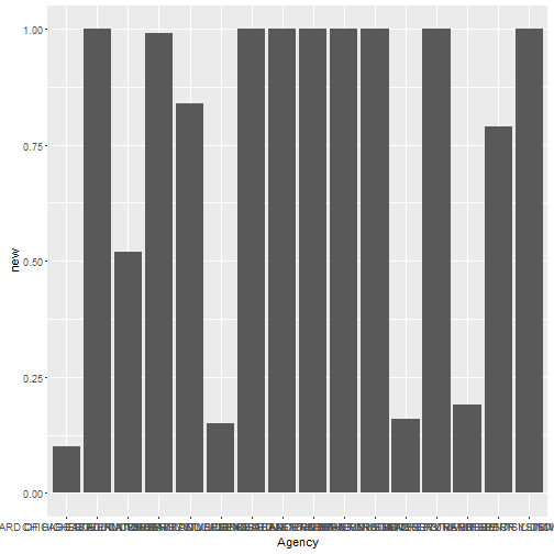
Here’s what that command did. From left to right.
“table” is the name of my dataset.
aes(x= Agency, y= new) tells ggplot to make my x axis the “Agency” variable and my y axis to be the “new” variable we created above.
And then, geom_bar(stat=”identity”) tells ggplot to do a bar chart and the “stat=identity” part tells R to plot the values exactly as they exist in the dataset, otherwise it would give you a count, which is not helpful.
However, I want the chart to be easy to read. One way to do that is to make the x axis sorted in a way that makes sense. Here’s how to do that.
ggplot(table, aes(x=reorder(Agency, -new), y = new)) + geom_bar(stat="identity")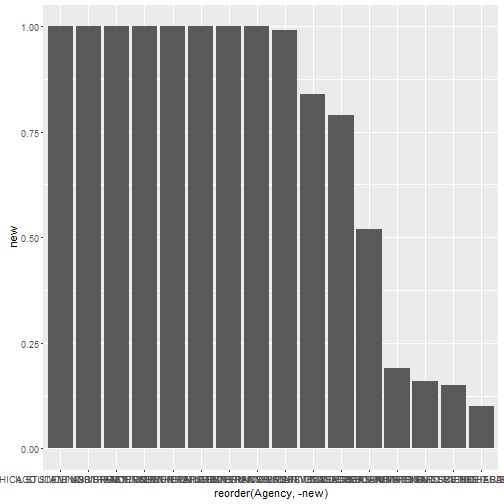
The “(x=reorder(Agency, -new)” is essentially this: my X axis is going to be the names of the agencies but I don’t want ggplot to just plot them in the same order as they exist in the dataset, I want it to plot them in order of highest percentage to least percentage, remember that’s my “new” variable that I created above. I put the negative sign to do that in descending order. If you left that off it would plot them order from least to most, not most to least.
That’s way easier to read.
So, we’re in the ballpark now.
First thing is to make the names of the agency to be readable.
ggplot(table, aes(x=reorder(Agency, -new), y = new)) + geom_bar(stat="identity") + theme(axis.text.x = element_text(angle = 90))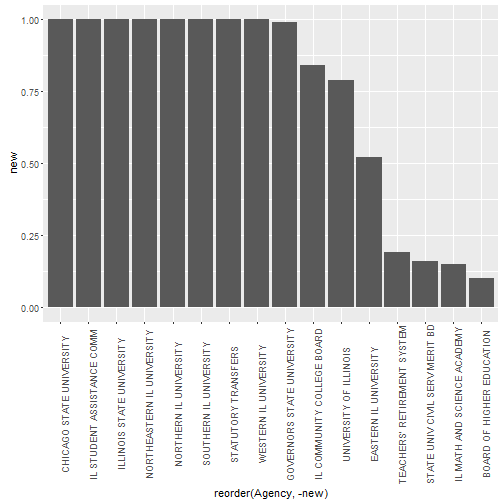
All I did was add this bit: + theme(axis.text.x = element_text(angle = 90)). That rotates the variable labels to 90 degrees. Now they are readable.
Now, I’ve got another problem that I want to fix. I’ve got a couple columns in there that aren’t state universities. I want to dump them. Let’s take a look at what rows they are.
table$Agency## [1] "UNIVERSITY OF ILLINOIS" "SOUTHERN IL UNIVERSITY"
## [3] "NORTHERN IL UNIVERSITY" "ILLINOIS STATE UNIVERSITY"
## [5] "WESTERN IL UNIVERSITY" "EASTERN IL UNIVERSITY"
## [7] "IL COMMUNITY COLLEGE BOARD" "NORTHEASTERN IL UNIVERSITY"
## [9] "IL MATH AND SCIENCE ACADEMY" "GOVERNORS STATE UNIVERSITY"
## [11] "CHICAGO STATE UNIVERSITY" "IL STUDENT ASSISTANCE COMM"
## [13] "BOARD OF HIGHER EDUCATION" "STATUTORY TRANSFERS"
## [15] "TEACHERS' RETIREMENT SYSTEM" "STATE UNIV CIVIL SERV MERIT BD"You can count the rows pretty easily here. I want to dump rows 7, 9, 12, 13, 14, 15, 16.
table <- table[-c(7, 9, 12, 13, 14, 15, 16), ]
table$Agency
## [1] "UNIVERSITY OF ILLINOIS" "SOUTHERN IL UNIVERSITY"
## [3] "NORTHERN IL UNIVERSITY" "ILLINOIS STATE UNIVERSITY"
## [5] "WESTERN IL UNIVERSITY" "EASTERN IL UNIVERSITY"
## [7] "NORTHEASTERN IL UNIVERSITY" "GOVERNORS STATE UNIVERSITY"
## [9] "CHICAGO STATE UNIVERSITY"Don’t forget the negative sign. That deletes those rows.
Let’s look at the plot again.
ggplot(table, aes(x=reorder(Agency, -new), y = new)) + geom_bar(stat="identity") + theme(axis.text.x = element_text(angle = 90))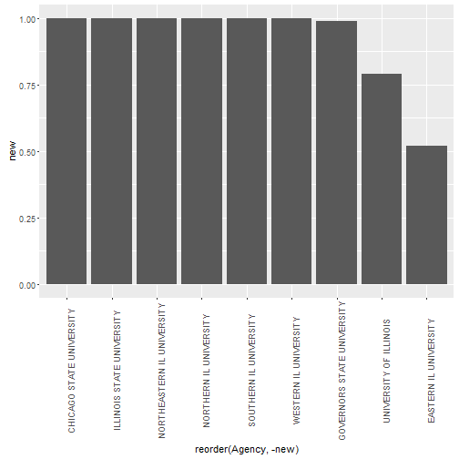
Now, we are pretty darn close. I really want to use a pop of color here to make EIU stand out. So, here’s how I do that. If I look at the table$Agency row I see that EIU is the sixth row. So I want to create a new column where EIU is different somehow. That will allow me to color it differently in the final chart. Here’s how I did that.
table$area.color <- c("one", "one", "one", "one", "one", "two" , "one", "one", "one")
table
## Code Agency Appropriated Expended.YTD
## 1 676 UNIVERSITY OF ILLINOIS 350599000 $278,180,288.41
## 2 664 SOUTHERN IL UNIVERSITY 106156000 $106,123,726.80
## 3 644 NORTHERN IL UNIVERSITY 48293000 $48,187,561.01
## 4 636 ILLINOIS STATE UNIVERSITY 38291000 $38,232,065.81
## 5 628 WESTERN IL UNIVERSITY 31389000 $31,388,984.95
## 6 612 EASTERN IL UNIVERSITY 26222000 $13,625,751.68
## 8 620 NORTHEASTERN IL UNIVERSITY 19562000 $19,490,653.45
## 10 616 GOVERNORS STATE UNIVERSITY 12757000 $12,659,464.51
## 11 608 CHICAGO STATE UNIVERSITY 12590000 $12,589,999.98
## Jul Aug Sep Oct Nov Dec
## 1 $52,107,615.06 $138,264.19 $225,934,409.16 $0.00 $0.00 $0.00
## 2 $12,865,996.99 $93,063,842.33 $193,887.48 $0.00 $0.00 $0.00
## 3 $48,158,000.00 $11,948.93 $17,612.08 $0.00 $0.00 $0.00
## 4 $38,215,378.90 $5,448.37 $11,238.54 $0.00 $0.00 $0.00
## 5 $14,994,121.25 $15,477,361.79 $917,501.91 $0.00 $0.00 $0.00
## 6 $6,125,882.69 $3,007,007.49 $4,492,861.50 $0.00 $0.00 $0.00
## 8 $19,562,000.00 ($81,475.14) $10,128.59 $0.00 $0.00 $0.00
## 10 $3,600,731.90 $9,057,168.37 $1,564.24 $0.00 $0.00 $0.00
## 11 $12,589,999.98 $0.00 $0.00 $0.00 $0.00 $0.00
## Jan Feb Mar Apr May Jun Unexpended new area.color
## 1 $0.00 $0.00 $0.00 $0.00 $0.00 $0.00 72418711.59 0.79 one
## 2 $0.00 $0.00 $0.00 $0.00 $0.00 $0.00 32273.20 1.00 one
## 3 $0.00 $0.00 $0.00 $0.00 $0.00 $0.00 105438.99 1.00 one
## 4 $0.00 $0.00 $0.00 $0.00 $0.00 $0.00 58934.19 1.00 one
## 5 $0.00 $0.00 $0.00 $0.00 $0.00 $0.00 15.05 1.00 one
## 6 $0.00 $0.00 $0.00 $0.00 $0.00 $0.00 12596248.32 0.52 two
## 8 $0.00 $0.00 $0.00 $0.00 $0.00 $0.00 71346.55 1.00 one
## 10 $0.00 $0.00 $0.00 $0.00 $0.00 $0.00 97535.49 0.99 one
## 11 $0.00 $0.00 $0.00 $0.00 $0.00 $0.00 0.02 1.00 oneSo, now we have a new column called area.color that has EIU listed as two and everyone else is listed as one. I can use that to my advantage now.
ggplot(table, aes(x=reorder(Agency, -new), y = new, fill=area.color)) + geom_bar(stat="identity") + theme(axis.text.x = element_text(angle = 90)) +scale_fill_manual(values = c("gray", "blue"))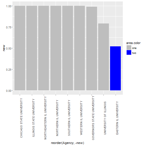
I added one new command here: +scale_fill_manual(values = c(“gray”, “blue”)) as well as adding “fill=area.color”
What that does is tell R to add a fill color based on the “area.color” column. The scale_fill_manaul command tells R which colors to pick for that fill command. All “one” will get gray, all “two” will get blue. That’s a pretty advanced task, but it’s easier the second time. Now, just some clean up stuff.
ggplot(table, aes(x=reorder(Agency, -new), y = new, fill=area.color)) + geom_bar(stat="identity") + theme(axis.text.x = element_text(angle = 90)) +scale_fill_manual(values = c("gray", "blue")) + xlab("University") + ylab("Percentage of Appropriation Received") + theme(legend.position="none") + theme(text=element_text(size=16, family="Roboto Medium")) + ggtitle("Percentage of Appropriation Received by Each University in Illinois")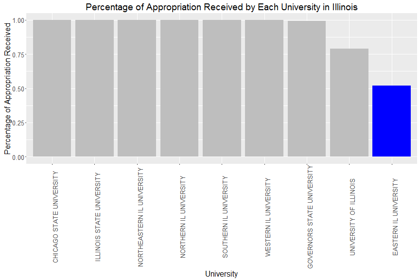
I added axis labels with the xlab and ylab commands. I added a title with the ggtitle command. I also changed my font with the theme(text=element_text(size=12, family=”Roboto Medium”)) command. I also got rid of the legend, because I don’t really need it and it doesn’t tell me much.